pacman::p_load(lubridate, tidyquant, ggHoriPlot,
timetk, ggthemes, plotly, tidyverse)In Class Exercise 10 - Financial Data Visualization
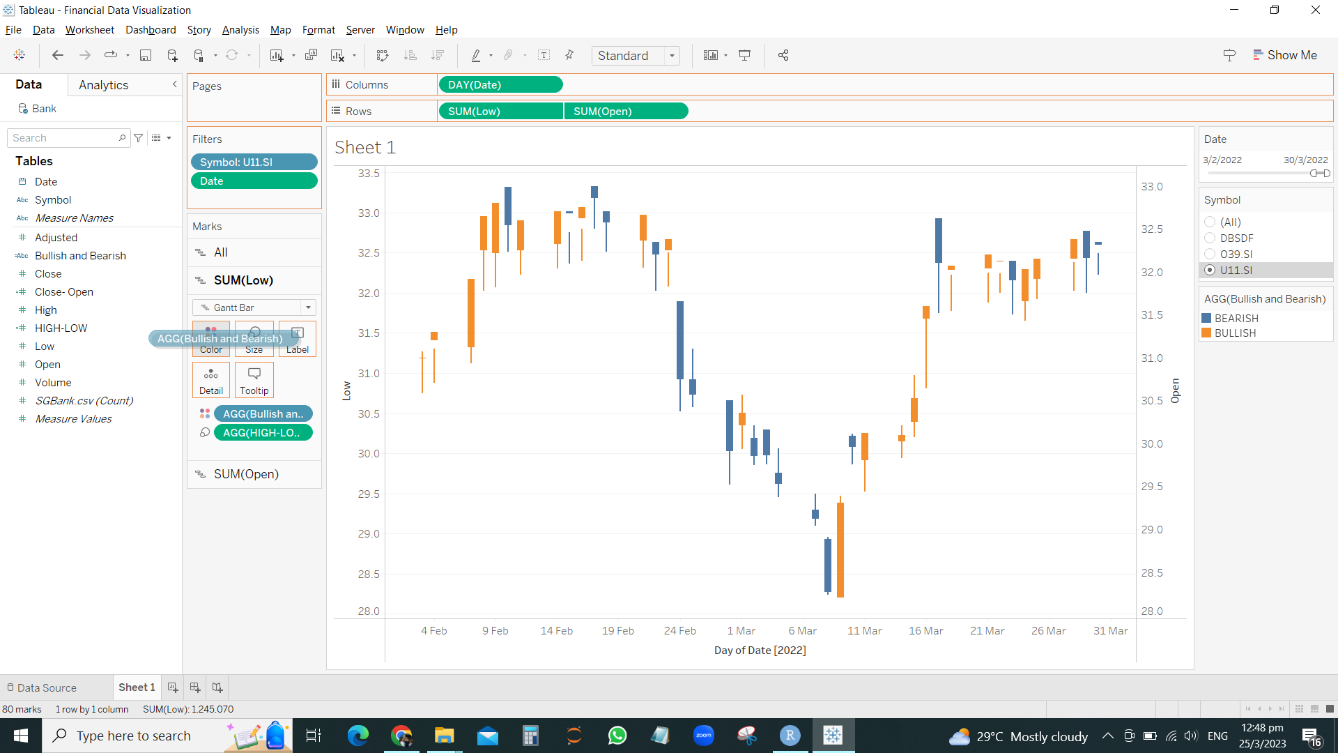
Candlestick chart by Tableau
Candle stick chart code in Tableau
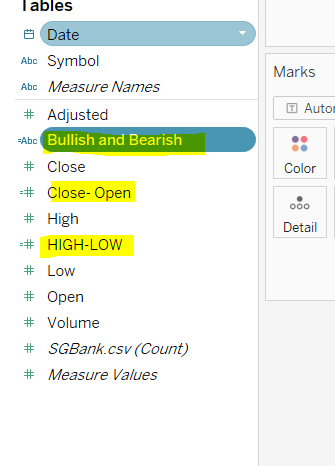
#close-open diff
SUM([Close]) - SUM([OPEN])
#hight-low diff
SUM([High]) - SUM([Low])
#bullish or bearish
IF SUM([OPEN]) > SUM([CLOSE]) THEN “BEARISH”
ELSE “BULLISH”
END
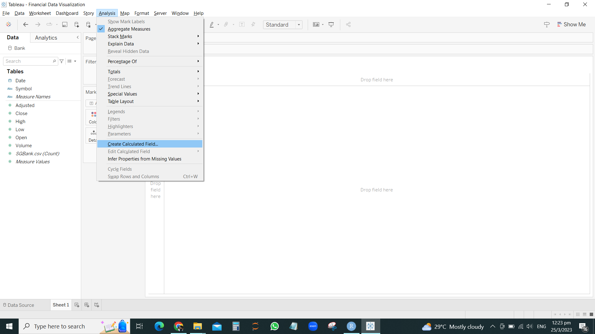
Add calculated field to add in formula CLOSE- OPEN / HIGH-LOW and BULLISH OR BEARISH
Drag variables COLUMNS and ROWS as followed
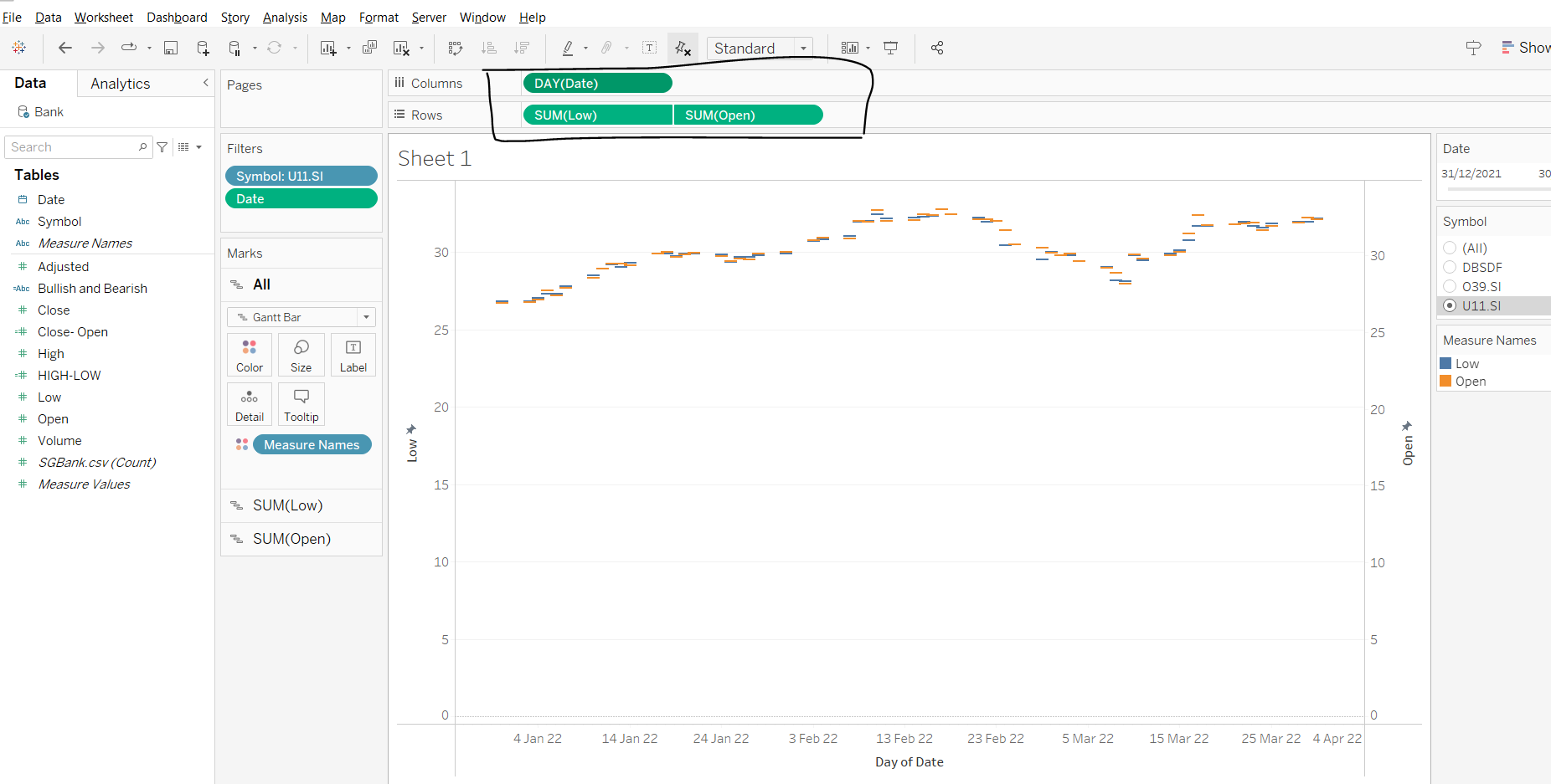
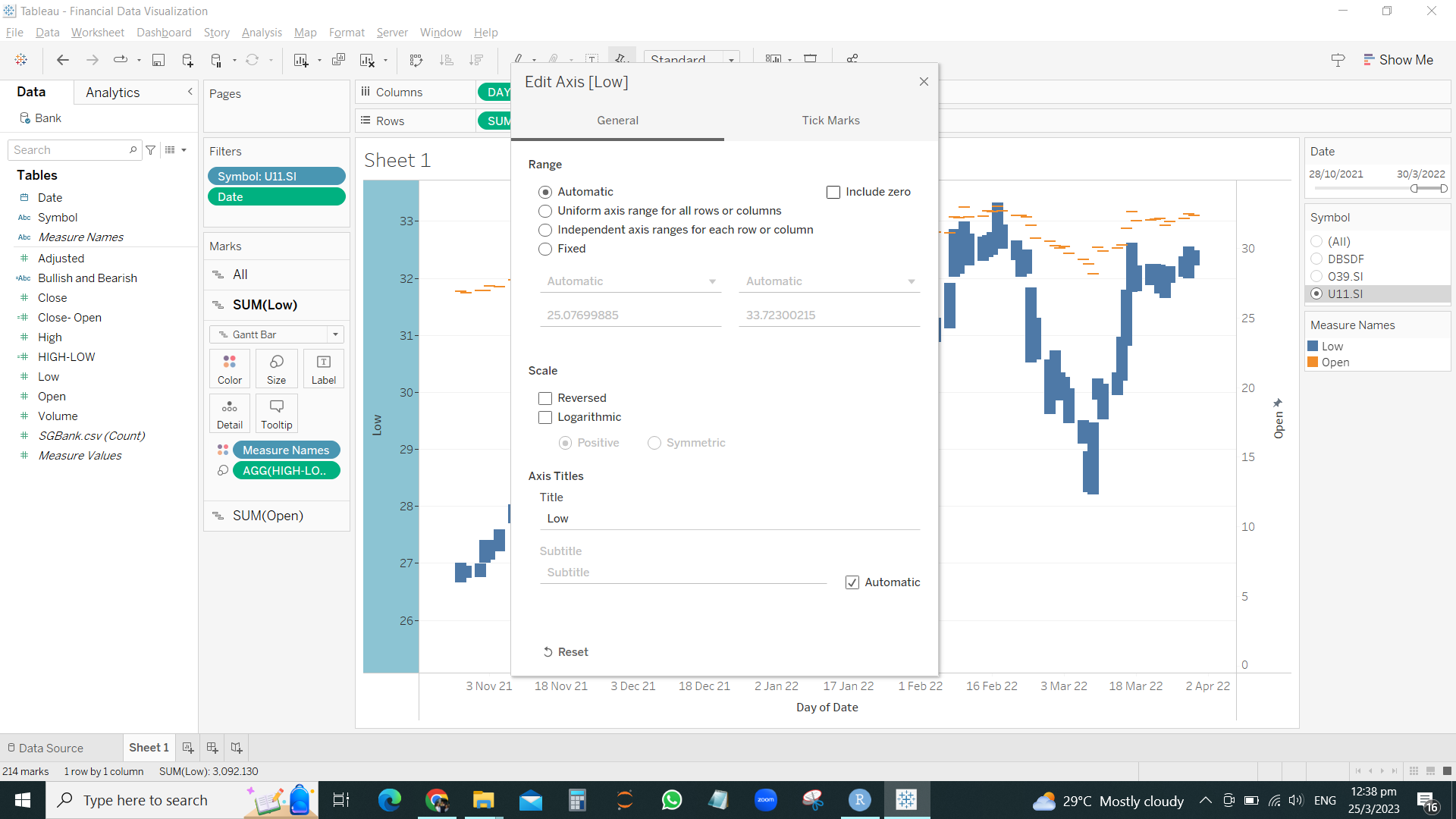
Drag HIGH LOW into Size for EACH axis ( left y-axis is SUM of Low , and right y-axis is SUM of High)
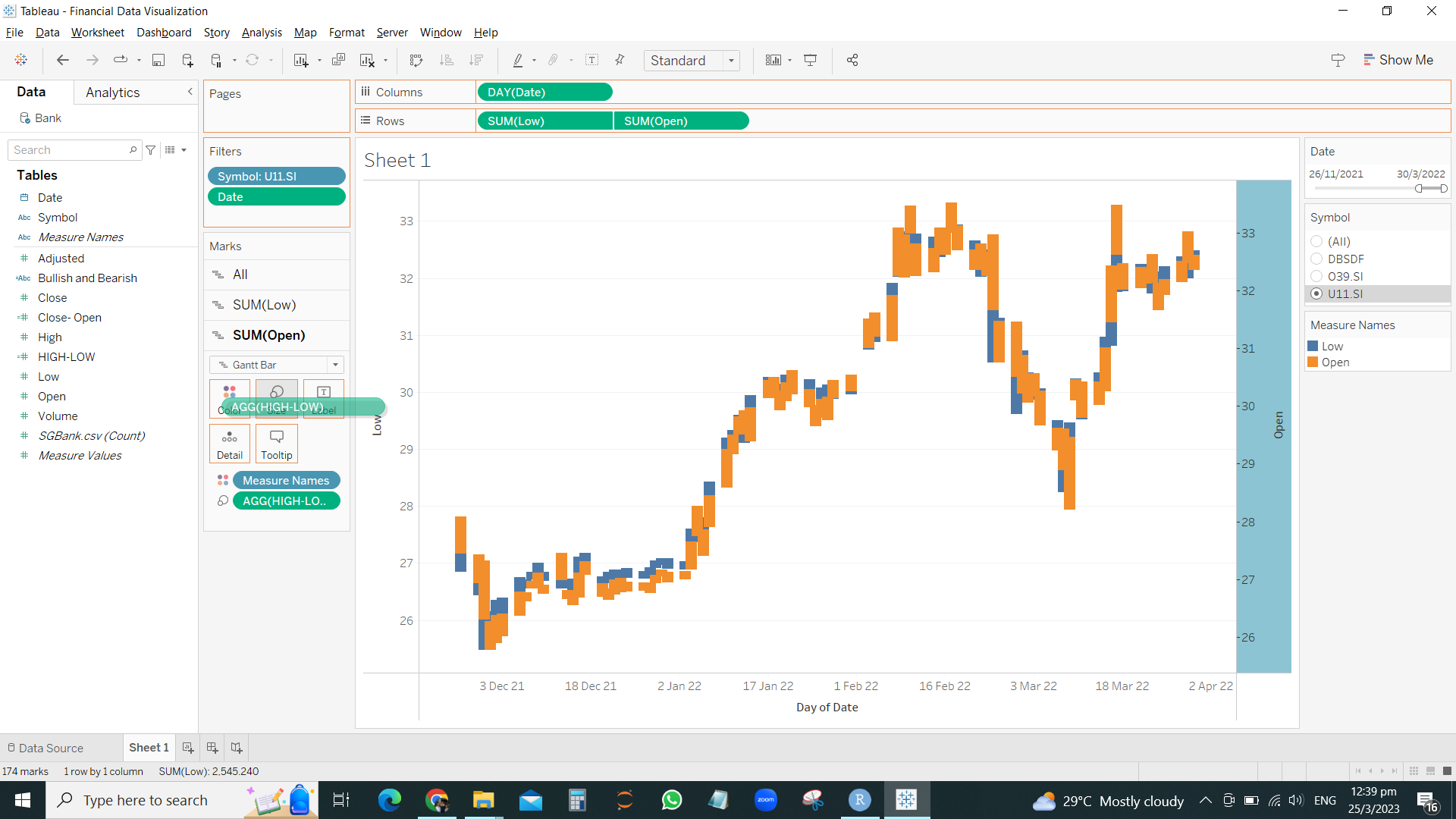
Drag HIGH-LOW to the Size of the SUM(LOW) and drag size to smallest
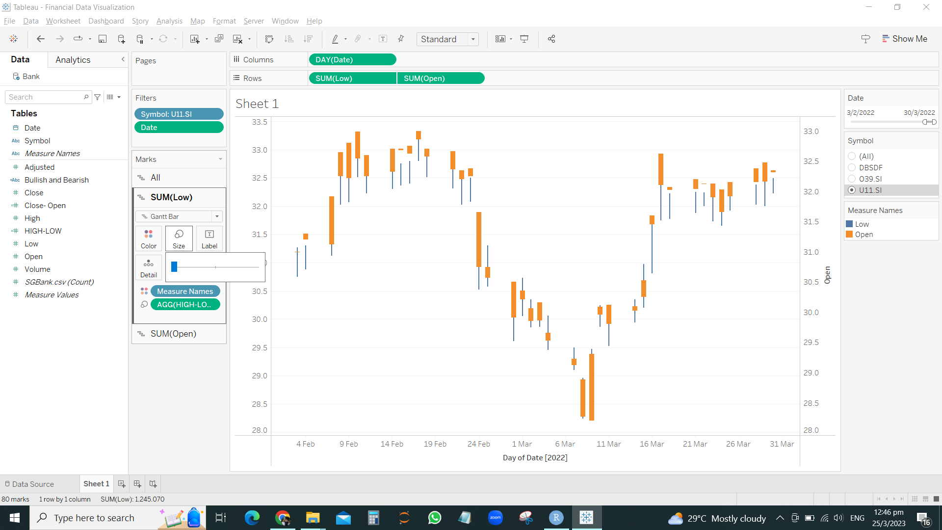
Drag the Close-Open to the Size of the Sum(Open) and keep the size bigs.

Drag the bearish / bullish into the colors for SUM(OPEN) and SUM(LOW)
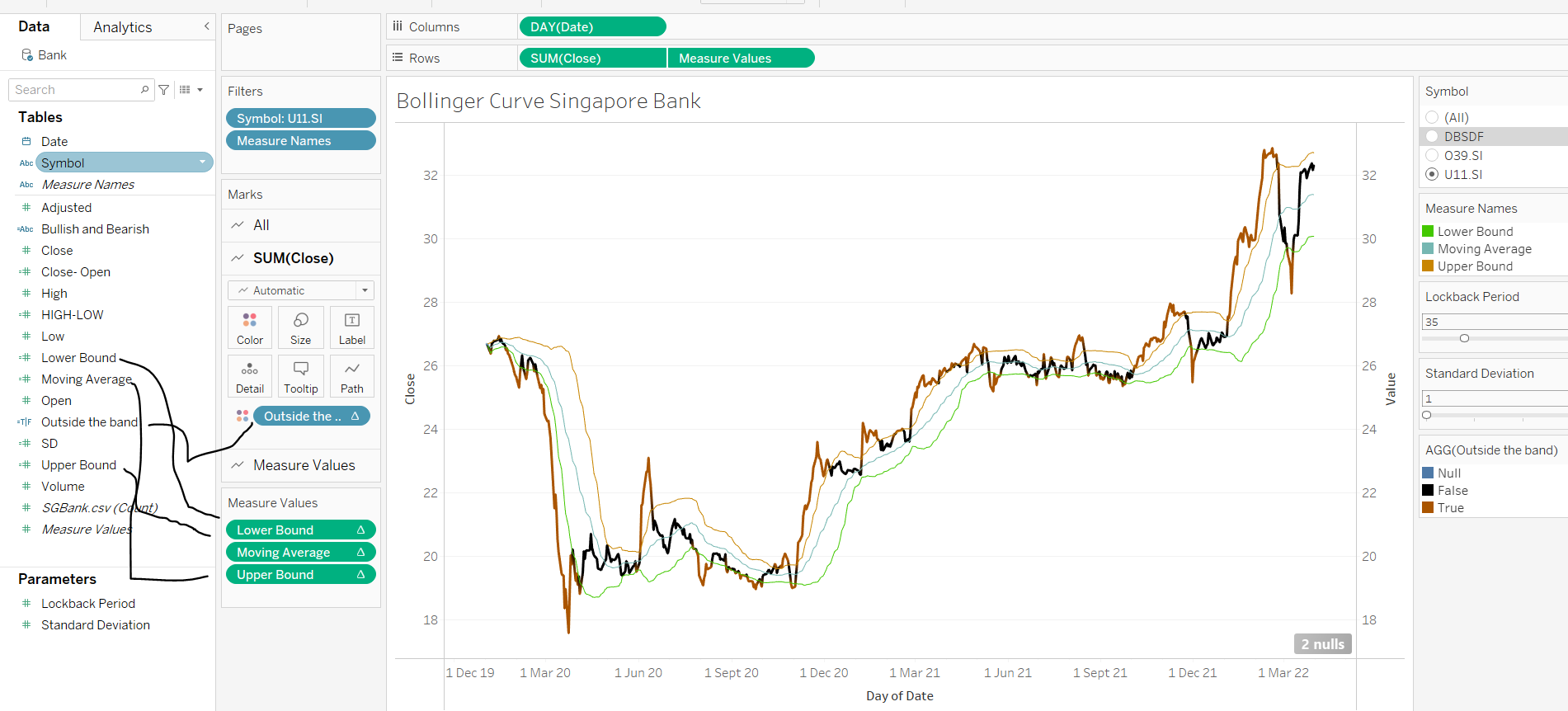
Bollinger Bands by Tableau
After insert variables into ROWS and COLUMNS
RIGHT CLICK > CREATE PARAMETER
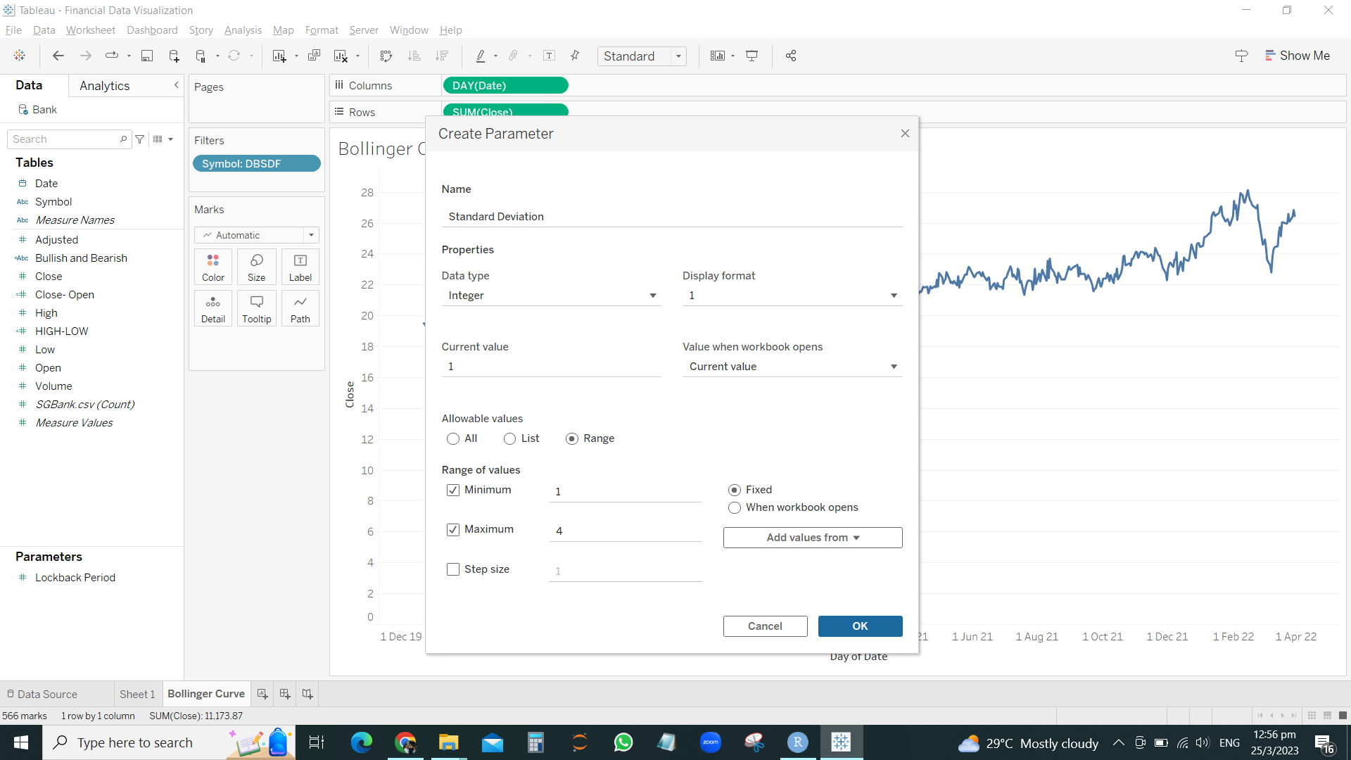
Now we have to create Calculated fields to insert these formula

Drag the MOVING AVERAGE to the 2nd right side Y-axis.
Remember to synchronize the axis
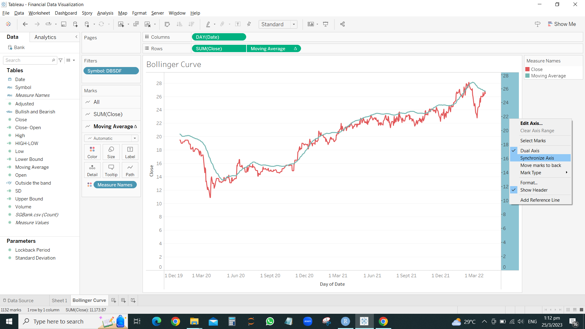
Drag the remaining LOWER BOUND and UPPER BOUND to the 2nd right Y-axis
Drag OUTSIDE THE BOUND into the SUM(CLOSE) color
Financial Data Visualization with R
company <- read_csv("C:/thomashoanghuy/ISSS608-VAA/InClassExercise/inclass10/data/companySG.csv")
Top40 <- company %>%
  slice_max(`marketcap`, n=40) %>%
select(symbol)head(Top40)# A tibble: 6 × 1
symbol
<chr>
1 SE
2 DBSDF
3 O39.SI
4 U11.SI
5 SNGNF
6 WLMIF Stock40_daily <- Top40 %>%
tq_get(get = "stock.prices",
from = "2020-01-01",
to = "2023-03-01") %>%
group_by(symbol) %>%
tq_transmute(select = NULL,
mutate_fun = to.period,
period = "days")PLOTTING HORIZONTAL GRAPH
Stock40_daily %>%
  ggplot() +
  geom_horizon(aes(x = date, y=adjusted), origin = "midpoint", horizonscale = 6)+
  facet_grid(symbol~.)+
  theme_few() +
  scale_fill_hcl(palette = 'RdBu') +
  theme(panel.spacing.y=unit(0, "lines"), strip.text.y = element_text(
    size = 5, angle = 0, hjust = 0),
    legend.position = 'none',
    axis.text.y = element_blank(),
    axis.text.x = element_text(size=7),
    axis.title.y = element_blank(),
    axis.title.x = element_blank(),
    axis.ticks.y = element_blank(),
    panel.border = element_blank()
    ) +
  scale_x_date(expand=c(0,0), date_breaks = "1 month", date_labels = "%b%y") +
ggtitle('Daily Adjusted Prices (Jan 2020 to Mar 2023)') 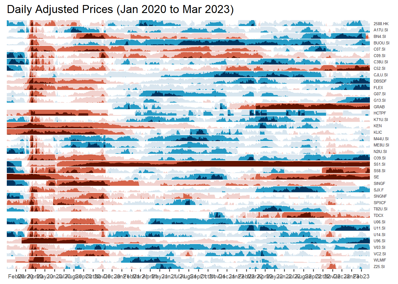
Now we want to show company name instead of Stock code.
Use left_join to append fields from column COMPANY of the original dataset into our ggplot dataset Stock40_daily
Stock40_daily <- Stock40_daily %>%
  left_join(company) %>%
  select(1:8, 11:12)
Replot
Stock40_daily %>%
  ggplot() +
  geom_horizon(aes(x = date, y=adjusted), origin = "midpoint", horizonscale = 6)+
  facet_grid(Name~.)+ #<<
  geom_vline(xintercept = as.Date("2020-03-11"), colour = "grey15", linetype = "dashed", size = 0.5)+ #<<
  geom_vline(xintercept = as.Date("2020-12-14"), colour = "grey15", linetype = "dashed", size = 0.5)+ #<<
  theme_few() +
  scale_fill_hcl(palette = 'RdBu') +
  theme(panel.spacing.y=unit(0, "lines"),
        strip.text.y = element_text(size = 5, angle = 0, hjust = 0),
    legend.position = 'none',
    axis.text.y = element_blank(),
    axis.text.x = element_text(size=7),
    axis.title.y = element_blank(),
    axis.title.x = element_blank(),
    axis.ticks.y = element_blank(),
    panel.border = element_blank()
    ) +
  scale_x_date(expand=c(0,0), date_breaks = "1 month", date_labels = "%b%y") +
ggtitle('Daily Adjusted Prices (Jan 2020 to Mar 2023)') 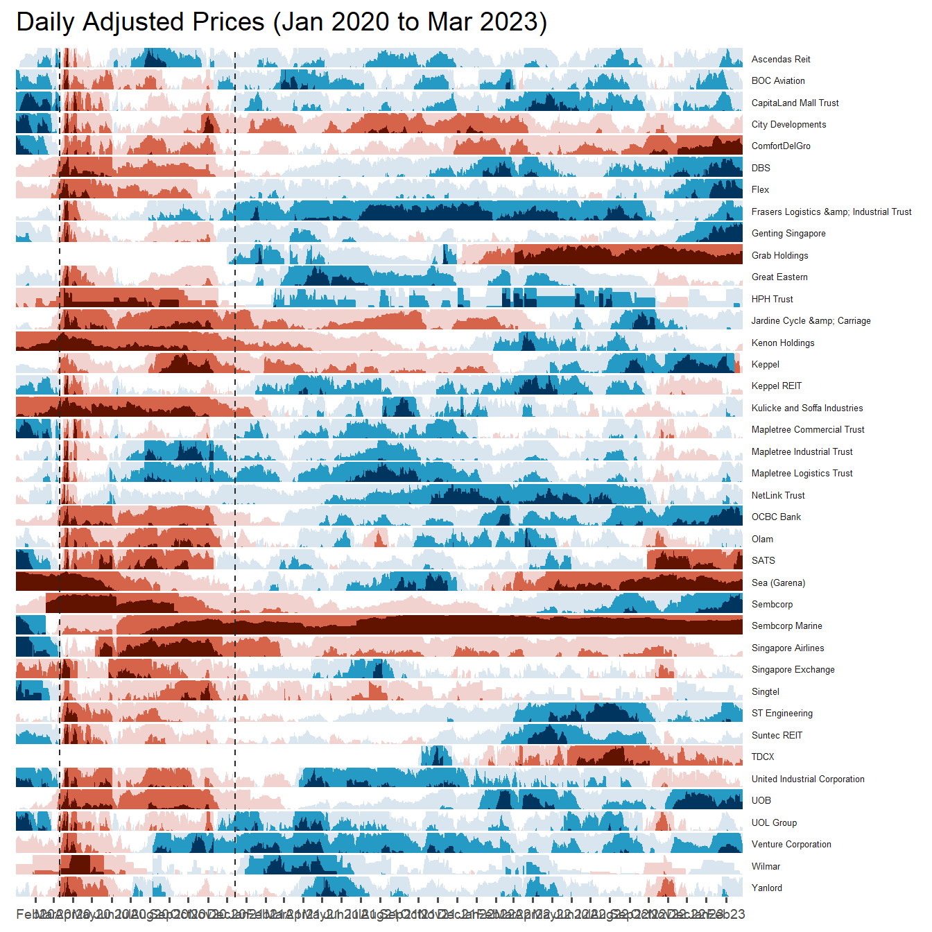
Plotting Stock Price Line Graph: ggplot methods
We isolate individual stock and use geom_line
Stock40_daily %>%
  filter(symbol == "DBSDF") %>%
  ggplot(aes(x = date, y = close)) +
    geom_line() +
    labs(title = "DBS Group Holdings Ltd (DBSDF) Daily Stock Price",
         y = "Closing Price", x = "") +
    theme_tq()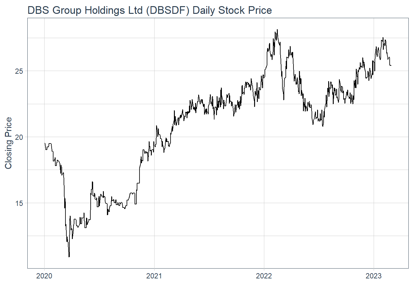
Plotting interactive stock price line graphs
In this section, we will create interactive line graphs for four selected stocks.
Step 1: Selecting the four stocks of interest by filter() from the Stock40_daily
selected_stocks <-  Stock40_daily %>%
  filter (`symbol` == c("C09.SI", "SINGF", "SNGNF", "C52.SI"))
Step 2: Plotting the line graphs by using ggplot2 functions and ggplotly() of plotly R package
p <- ggplot(selected_stocks,
            aes(x = date, y = adjusted)) +
  scale_y_continuous() +
  geom_line() +
  facet_wrap(~Name, scales = "free_y",) +
  theme_tq() +
  labs(title = "Daily stock prices of selected bearish stocks",
       x = "", y = "Adjusted Price") +
  theme(axis.text.x = element_text(size = 6),
        axis.text.y = element_text(size = 6))

ggplotly(p)
Plotting Candlestick Chart: tidyquant method
Before plotting the candlesticks, the code chunk below will be used to define the end data parameter. It will be used when setting date limits throughout the examples.
end <- as_date("2023-03-01")Plotting chart on DBS bank
Stock40_daily %>%
  filter(symbol == "DBSDF") %>%
  ggplot(aes(
    x = date, y = close)) +
  geom_candlestick(aes(
    open = open, high = high,
    low = low, close = close)) +
  geom_line(size = 0.5)+
    coord_x_date(xlim = c(end - weeks(12),
                          end),
                 ylim = c(20, 35),
                 expand = TRUE) +
  labs(title = "DBS Group Holdings Ltd (DBSDF) Daily Stock Price",
       y = "Closing Price", x = "") +
  theme_tq()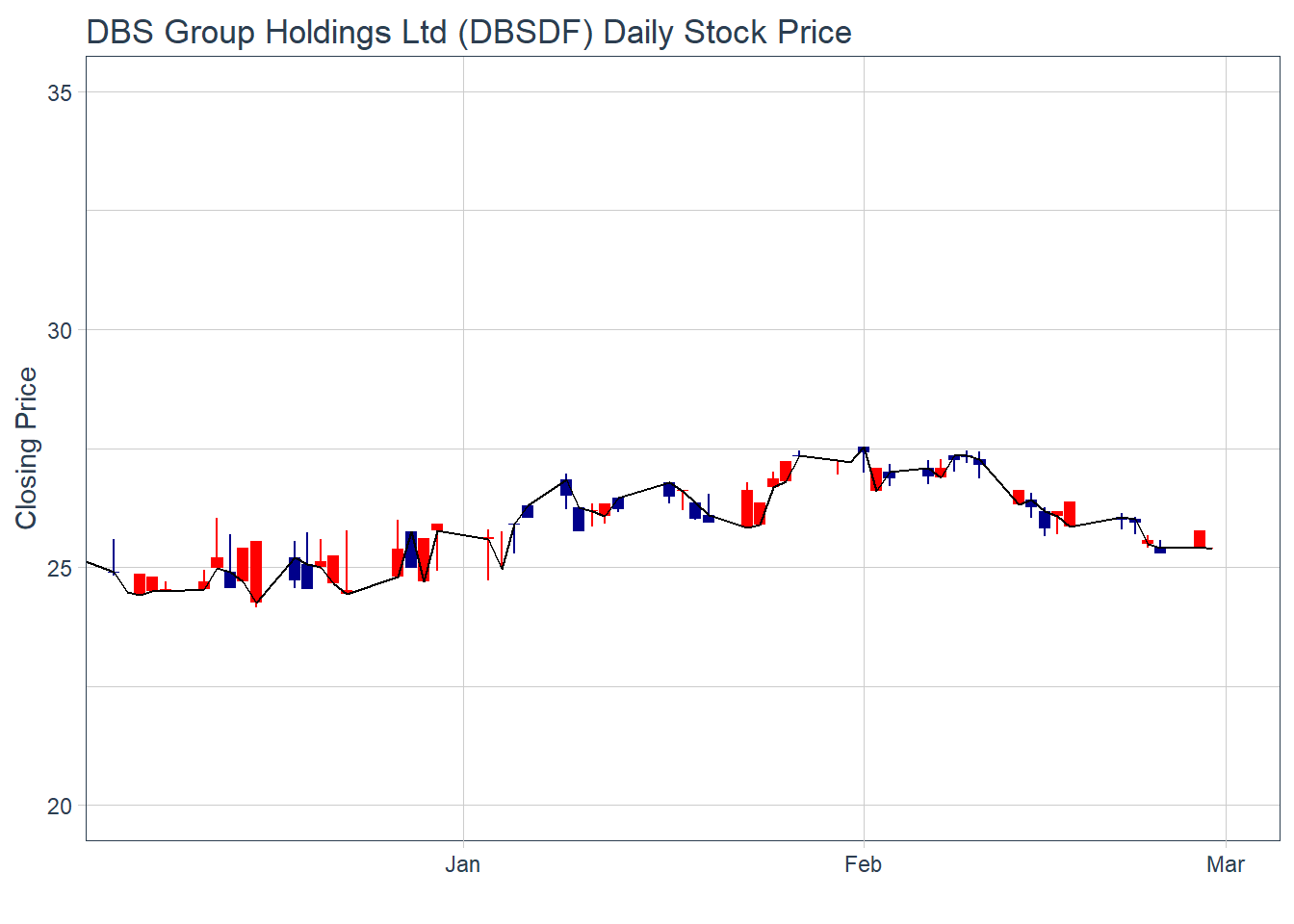
We use “coord_x_date(xlim = c(end - weeks(12), end)” , which we can control how many weeks from the last date (01/03/23) that we want to show on the chart. In this case, it’s lastest 12 weeks up til 01/03/23
Now let’s add in Moving average line with candle stick by geom_ma
In this case, there are 2 moving averages, N=5 and N=20
Stock40_daily %>%
  filter(symbol == "DBSDF") %>%
  ggplot(aes(
    x = date, y = close)) +
  geom_candlestick(aes(
    open = open, high = high,
    low = low, close = close)) +
  geom_line(size = 0.5)+
  geom_ma(color = "darkgreen", n = 20) +
  geom_ma(color = "lightgreen", n = 5) +
    coord_x_date(xlim = c(end - weeks(12),
                          end),
                 ylim = c(20, 35),
                 expand = TRUE) +
  labs(title = "DBS Group Holdings Ltd (DBSDF) Daily Stock Price",
       subtitle = "darkgreen = 1-day MA, lightgreen = 5-day MA",
       y = "Closing Price", x = "") +
  theme_tq()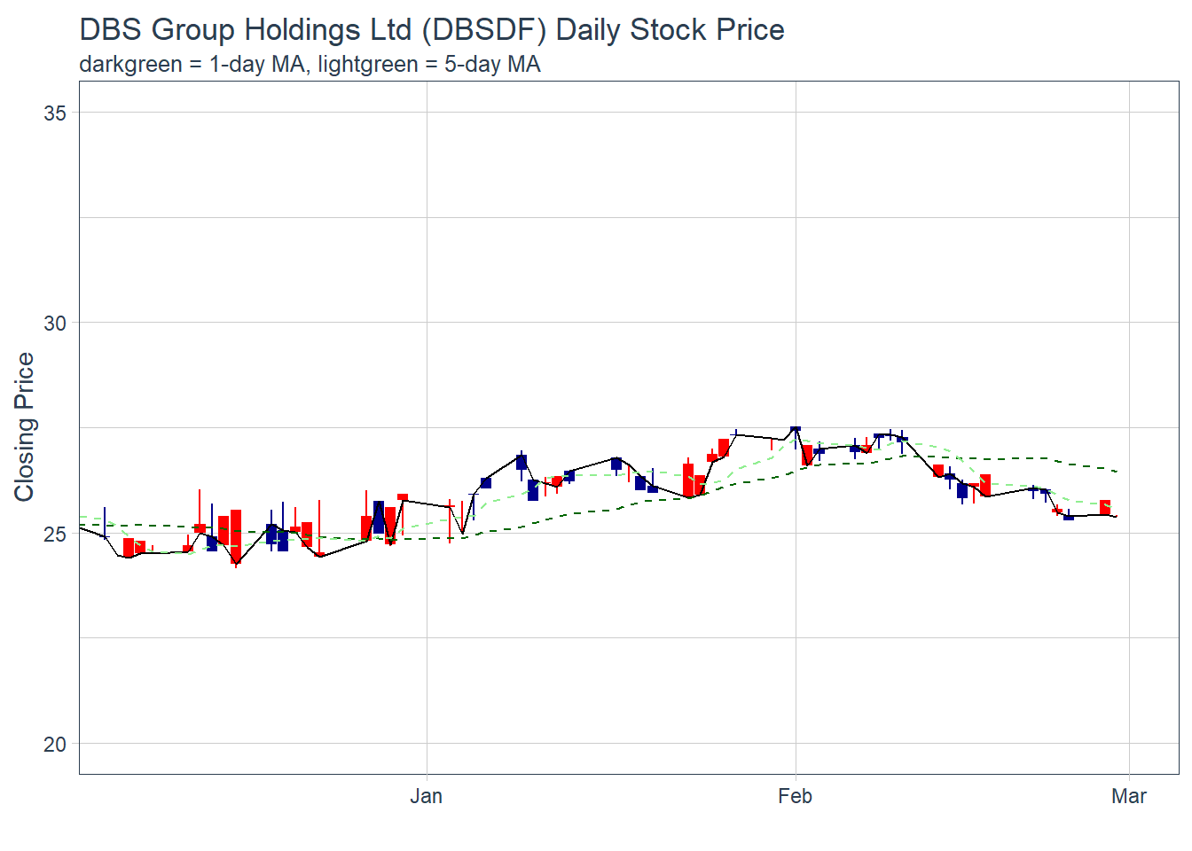
Plotting Bollinger Band with tidyquant method
We can use geom_bbands() for this
in geom_bband aes(), we have to indicate high = “High” column of the dataset, and low = “Low” column of th edataaset and so on. We also have to indicate the sd (standard deviation) = 1 to 5 ( usually) and N = 20 for the SMA (simple moving average)
Stock40_daily %>%
  filter(symbol == "DBSDF") %>%
  ggplot(aes(x=date, y=close))+
  geom_line(size=0.5)+
  geom_bbands(aes(
    high = high, low = low, close = close),
    ma_fun = SMA, sd = 2, n = 20,
    size = 0.75, color_ma = "royalblue4",
    color_bands = "red1")+
    coord_x_date(xlim = c("2020-02-01",
                          "2022-03-31"),
                 expand = TRUE)+
    labs(title = "DBS Group Holdings Ltd (DBSDF) Daily Stock Price",
         subtitle = "dotted red lines = bollinger bands",
         x = "Date", y ="Price") +
theme(legend.position="none")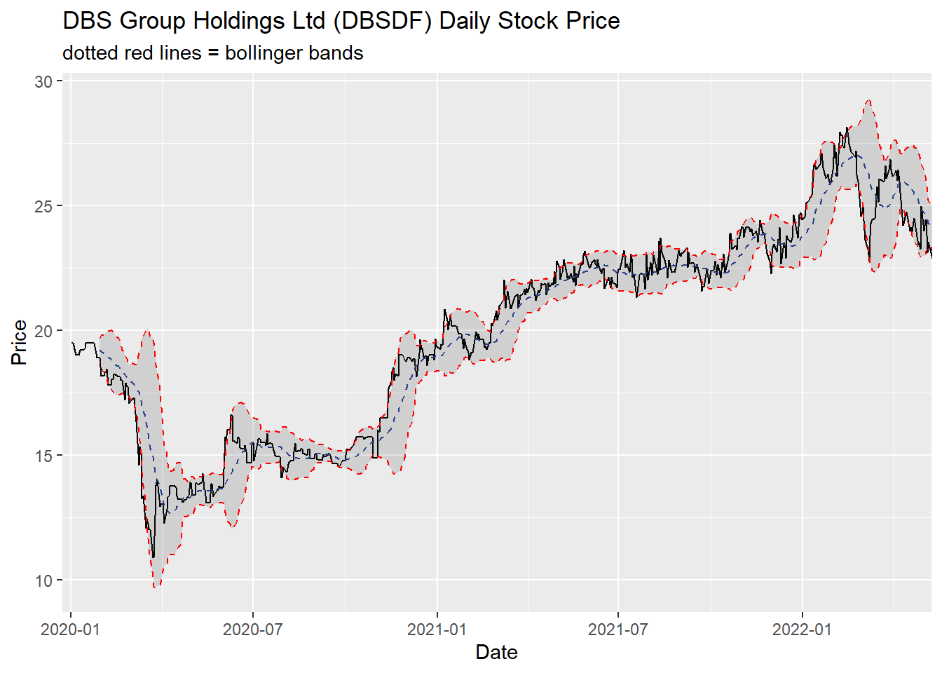
Extra - Interactive candle stick plot by creating a new function
candleStick_plot<-function(symbol, from, to){
  tq_get(symbol, from = from, to = to, warnings = FALSE) %>%
    mutate(greenRed=ifelse(open-close>0, "Red", "Green")) %>%
    ggplot()+
    geom_segment(
      aes(x = date, xend=date, y =open, yend =close, colour=greenRed),
      size=3)+
    theme_tq()+
    geom_segment(
      aes(x = date, xend=date, y =high, yend =low, colour=greenRed))+
    scale_color_manual(values=c("ForestGreen","Red"))+
    ggtitle(paste0(symbol," (",from," - ",to,")"))+
    theme(legend.position ="none",
          axis.title.y = element_blank(),
          axis.title.x=element_blank(),
          axis.text.x = element_text(angle = 0, vjust = 0.5, hjust=1),
          plot.title= element_text(hjust=0.5))
}
And once we plot, we can just indicate symbol of the stock, from timestamp and to timestamp
p <- candleStick_plot("DBSDF",
                      from = '2022-01-01',
                      to = today())
ggplotly(p)