pacman::p_load(tidyverse, ggplot2, forcats)HandsonEx01
Install and Launching R packages The code chunk below use p_load of pacman package to check if tidyverse packages are installed in te environment, it will luanch it into R if it has been installed.
exam_data <- read_csv("data/Exam_data.csv",
                      show_col_types = FALSE)
View Math Result using R hist
hist(exam_data$MATHS,
     main = "Histogram of Maths Exams Result",
     xlab = "Score",
     xlim = c(0, 100),
     ylab = "Count",
     ylim = c(0, 80),
     col = "green",
     freq = TRUE)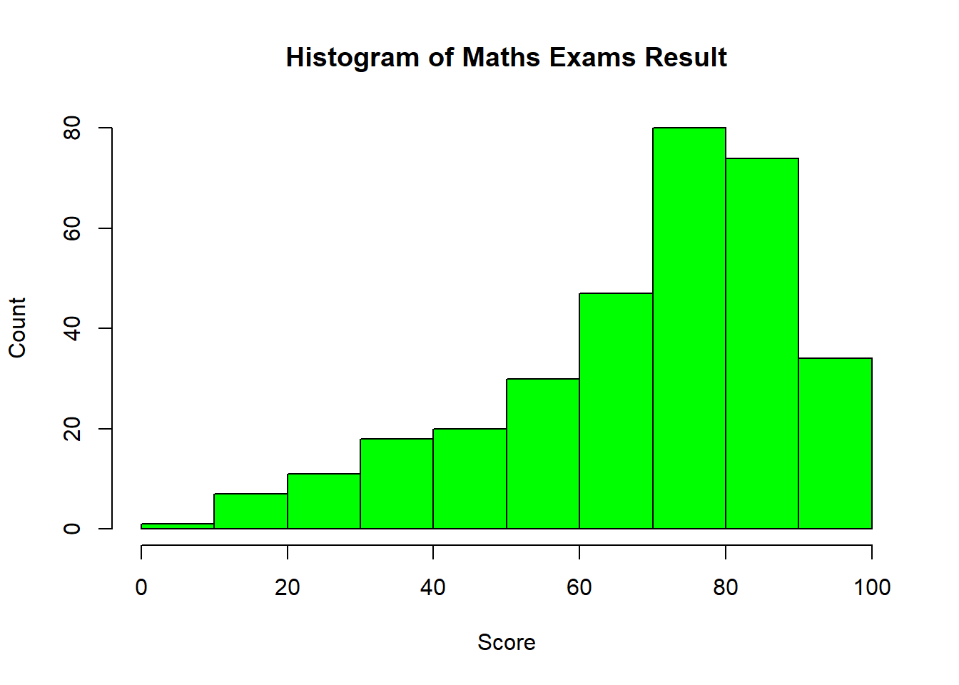
Do the same thing but in ggplot
ggplot(data = exam_data, aes(x = MATHS)) +

  geom_histogram(bins = 10,
                 boundary = 100,
                 color = "black",
                 fill = "lightblue") +

  labs(title = "Histogram of Math Exam Results",
       subtitle = "Maths",
       x = "Score",
       y = "Count") +

  theme_bw()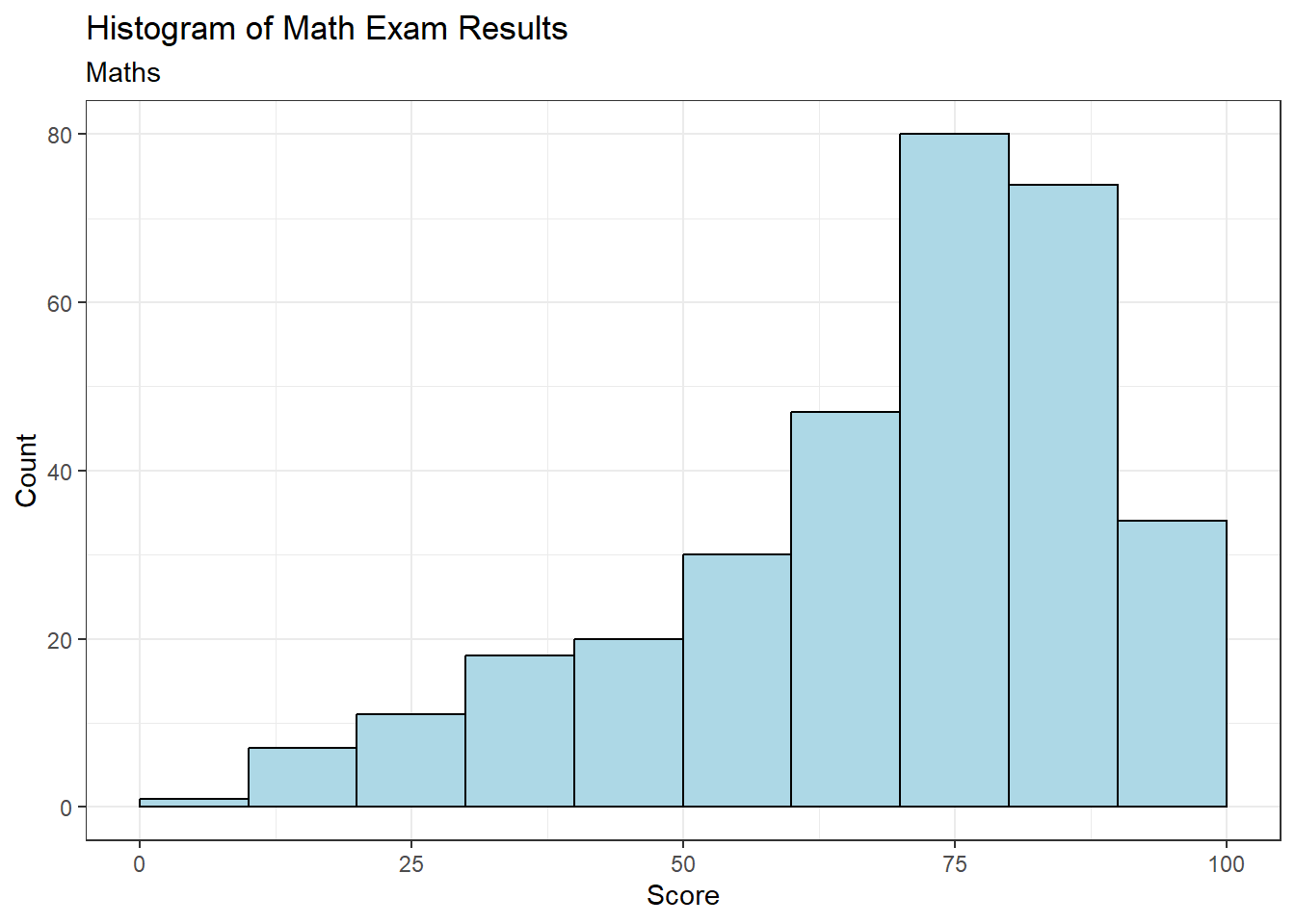
On ggplot2, you can use other types of graphs and not only restricted to 1 function
ggplot(data = exam_data,
       aes(x = MATHS)) +
  geom_dotplot(binwidth = 2.5, dotsize = 0.5) +
  scale_y_continuous(NULL, breaks = NULL) +
  theme_bw()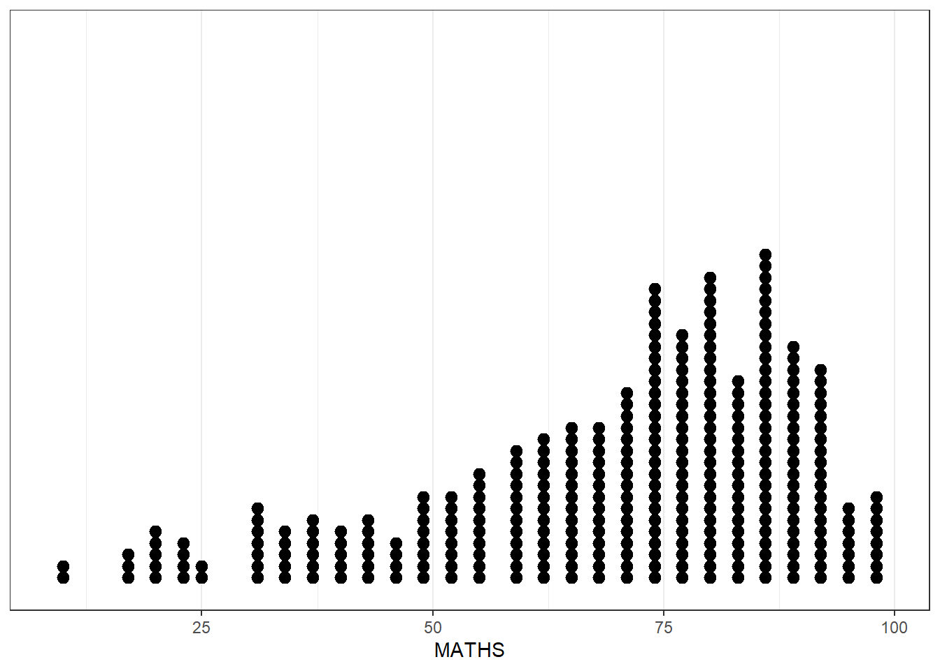
View Math Result using ggplot2 histogram, notice the smaller number of bins
ggplot(data = exam_data,
       aes(x = MATHS)) +
  geom_histogram(bins = 20,
                 color = "black",
                 fill = "lightblue") +
  theme_bw()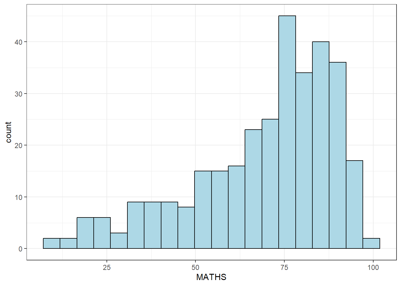
Now to combine with other information, such as gender.
ggplot(data = exam_data,
       aes(x = MATHS,
           fill = GENDER)) +
  geom_histogram(bins = 20,
                 color = "lightblue")+
  theme_bw()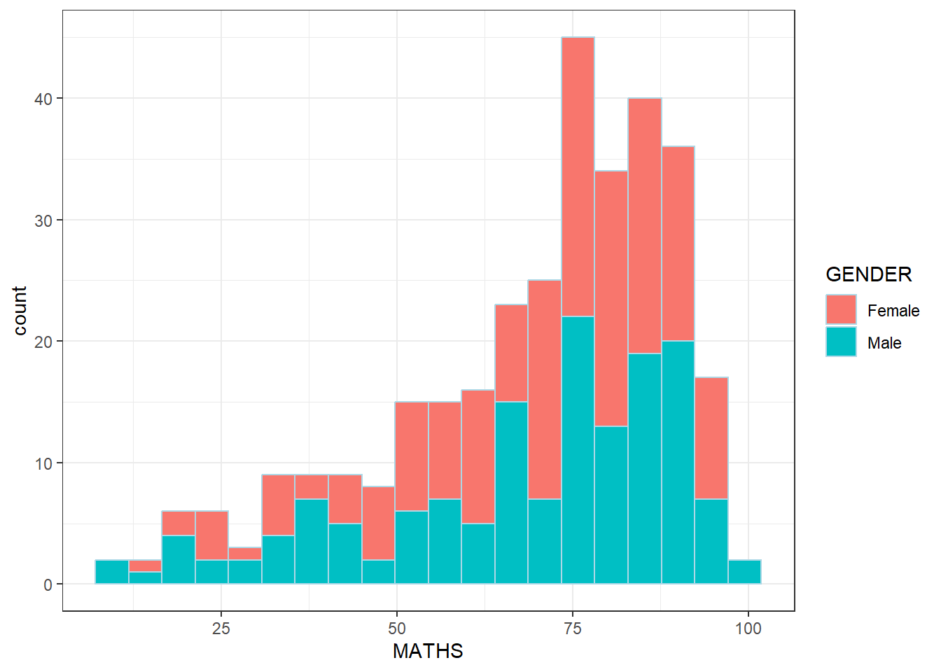
Comparing between 2 genders by ggplot density
ggplot(data = exam_data,
       aes(x = MATHS,
           colour = GENDER)) +
  geom_density() +
  theme_bw()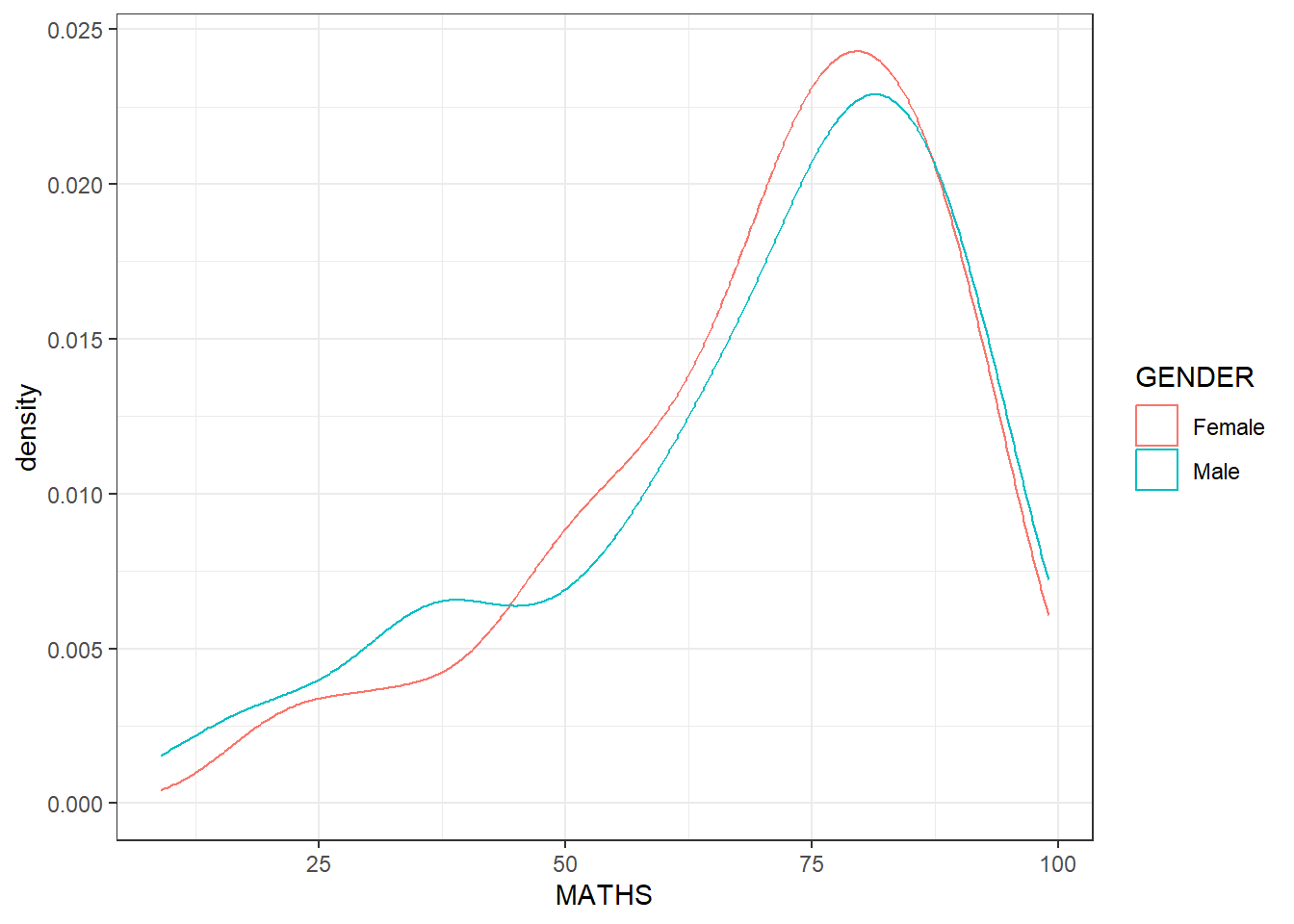
Ggplot Boxplot (notched)
ggplot(data = exam_data,
       aes(y = MATHS,
           x = GENDER)) +
  geom_boxplot(notch = TRUE) +
  theme_bw()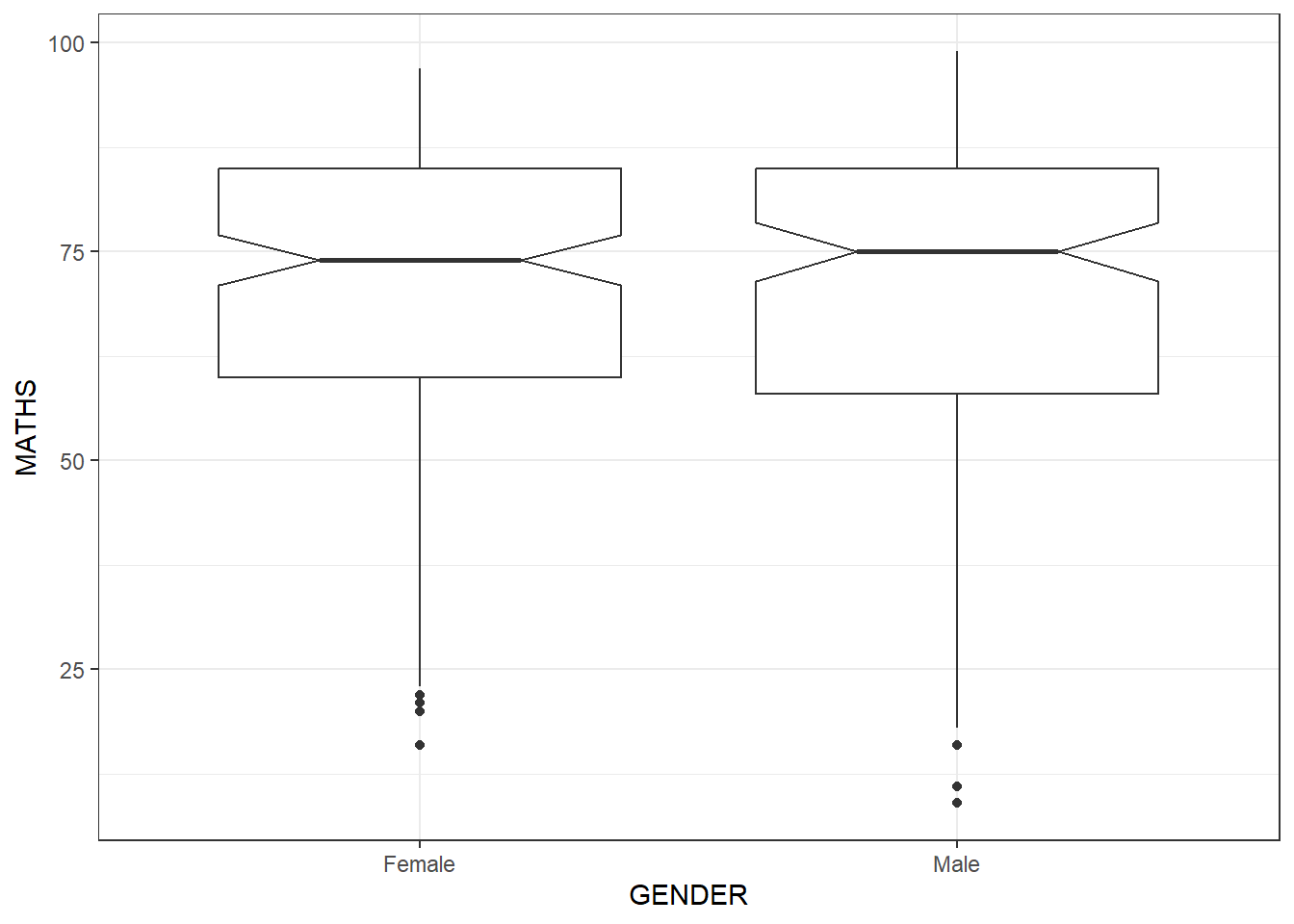
GGPLOT Boxplot and Point
ggplot(data = exam_data,
       aes(y = MATHS,
           x = GENDER)) +
  geom_boxplot() +
  geom_point(position = "jitter", size = 0.5) +
  theme_bw()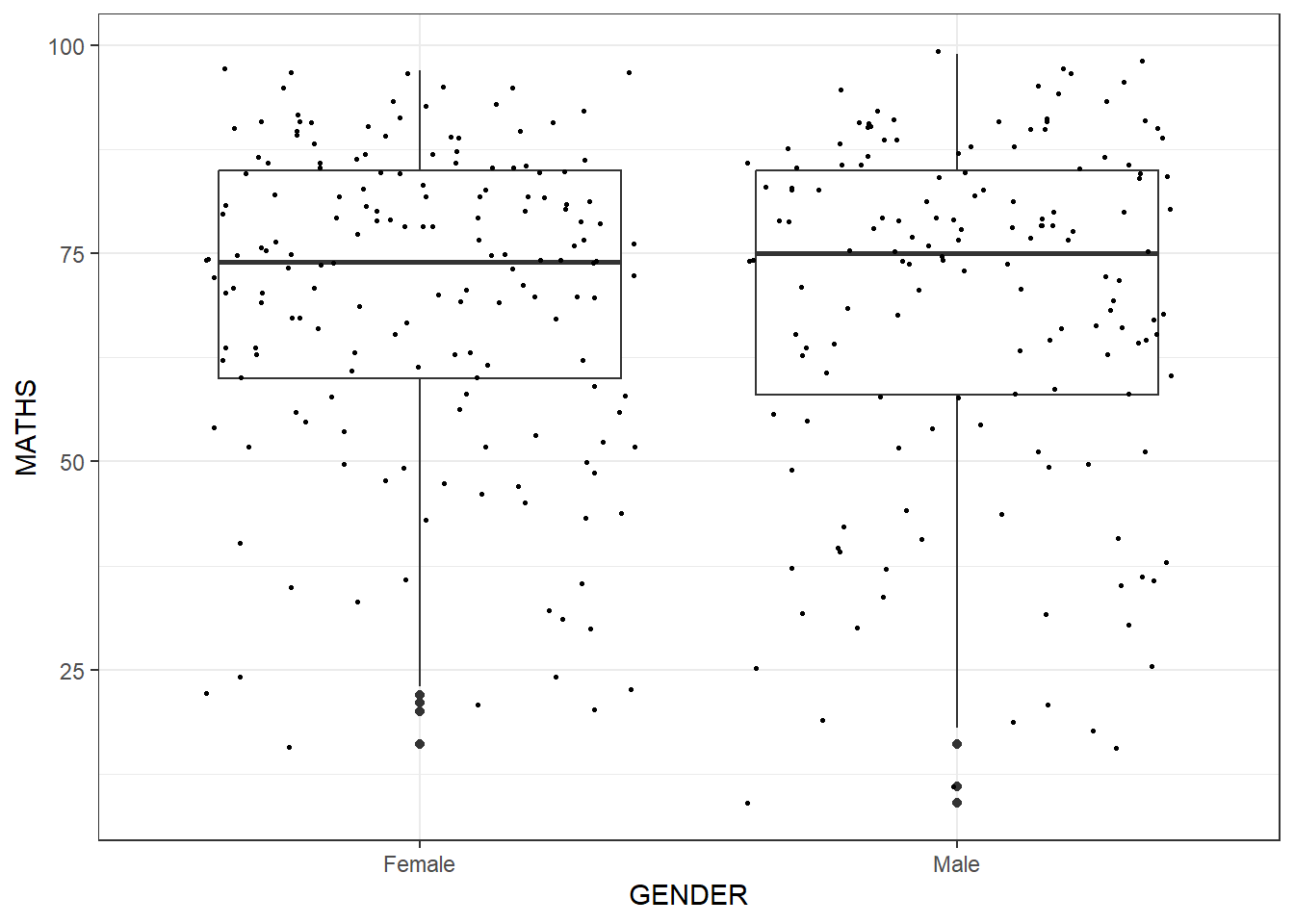
GGplot Boxplot with Violin plot
ggplot(data = exam_data,
       aes(y = MATHS,
           x = GENDER)) +
  geom_violin(fill = "lightblue") +
  geom_boxplot(alpha = 0.5) +
  theme_bw()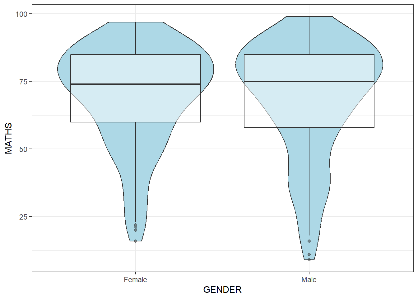
Now, you can combine boxplot with Stats summary (mean)
ggplot(data = exam_data,
       aes(y = MATHS,
           x = GENDER)) +
  geom_boxplot() +
  stat_summary(geom = "point",
               fun = "mean",
               colour = "red",
               size = 4) +
  theme_bw()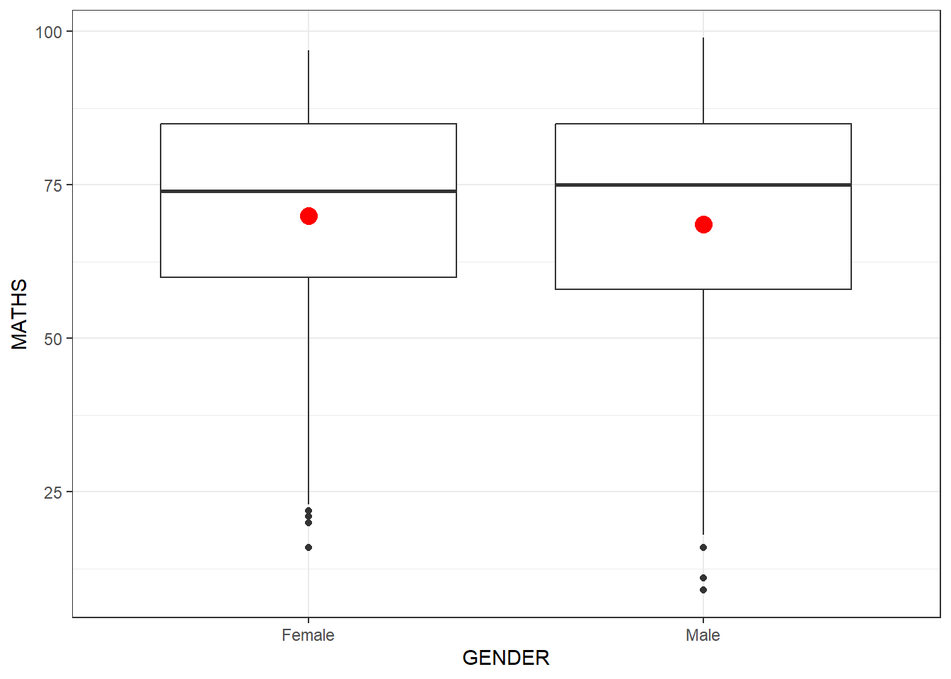
NOTE: Math score is a continuous variable , while Gender is nominal variable (categorized and cannot be organized into orders/sequences), we can use boxplot to draw the Bivariate relationship between these 2 types of variables
However, but TWO continuous variables, we can use something else
GGPLOT geom_point between English and Maths scores ( also known as Scatterplot )
ggplot(data = exam_data,
       aes(x = MATHS,
           y = ENGLISH)) +
  geom_point() +
  theme_bw()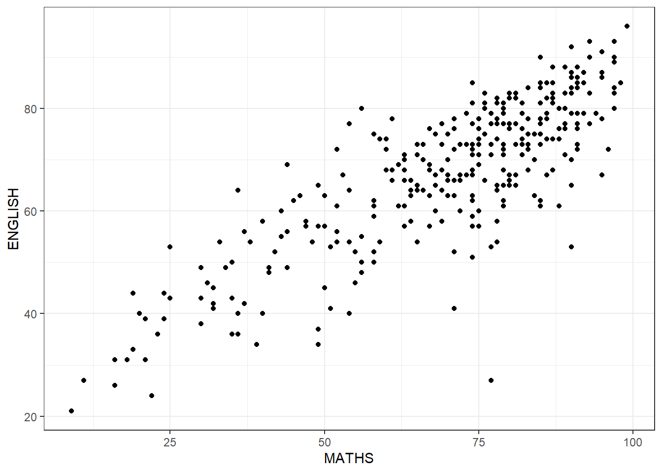
Now if we attempt to draw a fitted line through this scatterplot to see the trend
ggplot(data = exam_data,
       aes(x = MATHS,
           y = ENGLISH)) +
  geom_point() +
  # default method used for smooth is loess
  # geom_smooth(linewidth = 0.5)
  geom_smooth(linewidth = 0.5, method = lm) +
  coord_cartesian(xlim = c(0, 100), ylim = c(0, 100)) + #this is to make sure both axis start from 0 and max = 100
  theme_bw()
`geom_smooth()` using formula = 'y ~ x'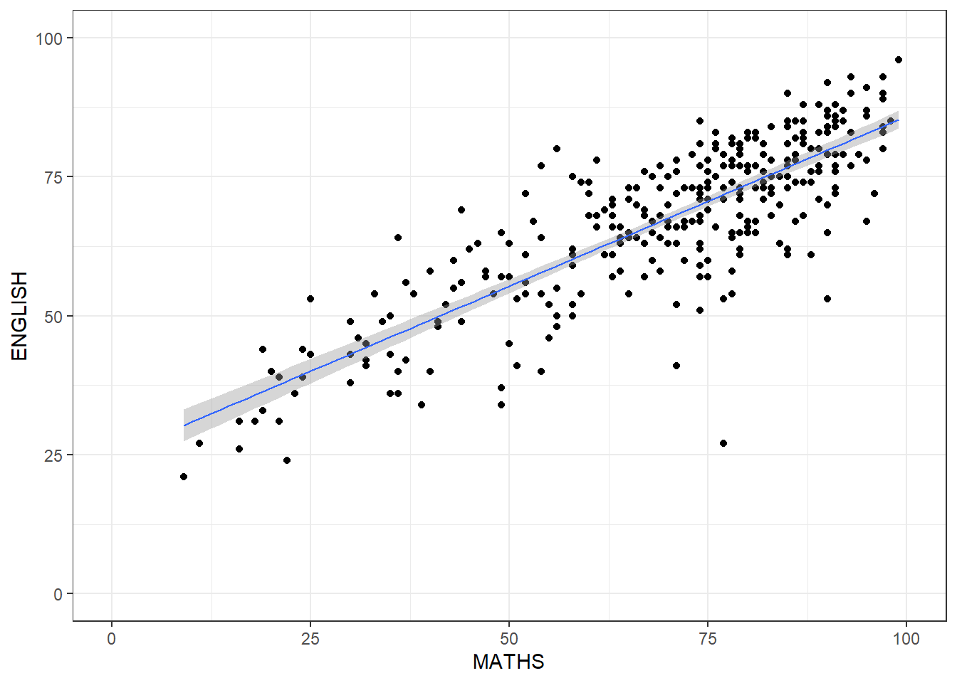
View results by splitting them into each classes (try with historgram) by this function facet_wrap
ggplot(data = exam_data,
       aes(x = MATHS)) +
  geom_histogram(bins = 20) +
    facet_wrap(~ CLASS) +
  theme_bw()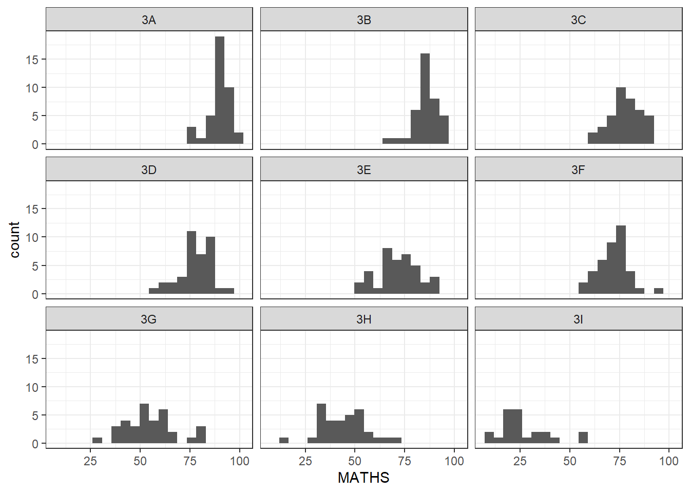
instead, if we use facet_grid
ggplot(data = exam_data,
       aes(x = MATHS)) +
  geom_histogram(bins = 20) +
    facet_grid(~ CLASS) +
  theme_bw()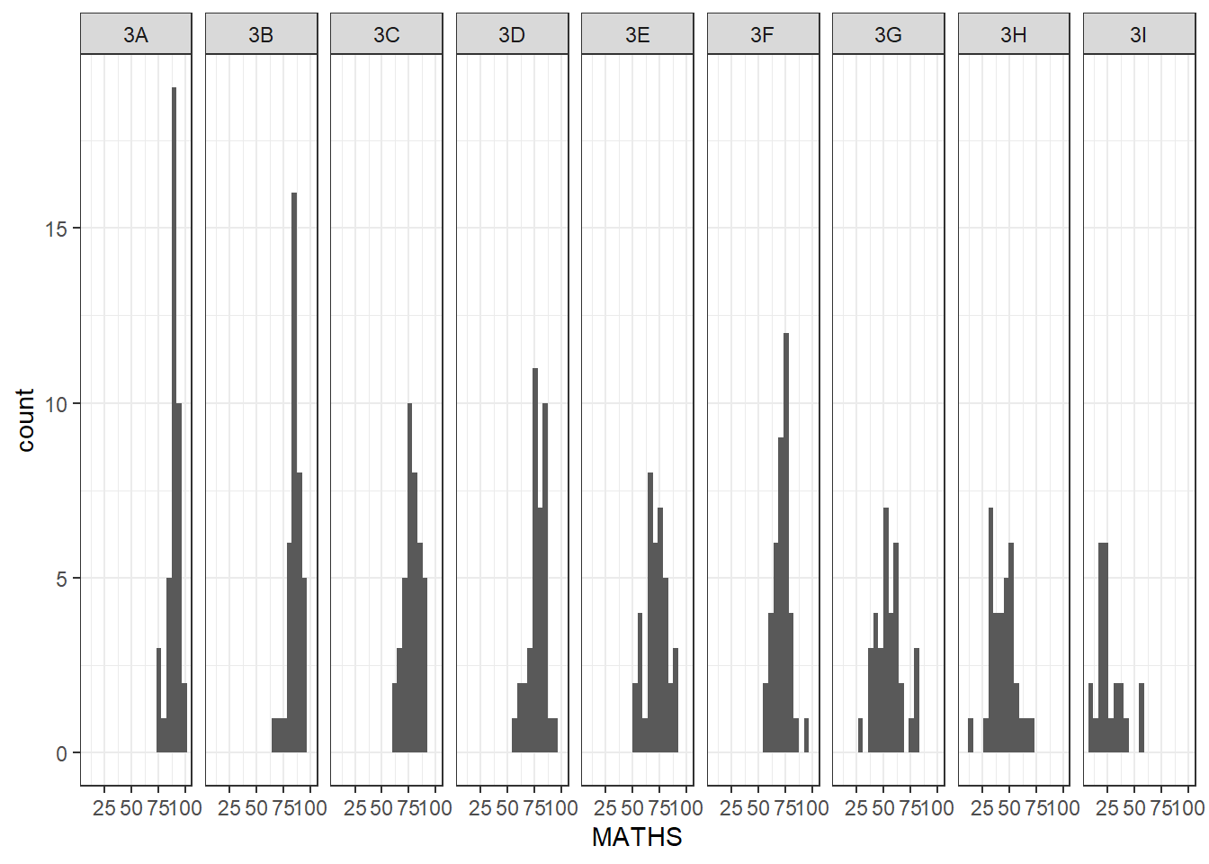
Facet_grid can look better if one of the variables are of smaller number of categories, such as gender
ggplot(data = exam_data, aes(y = MATHS, x = CLASS)) +
  geom_boxplot() +
    facet_grid(cols = vars(GENDER)) +
      theme_bw()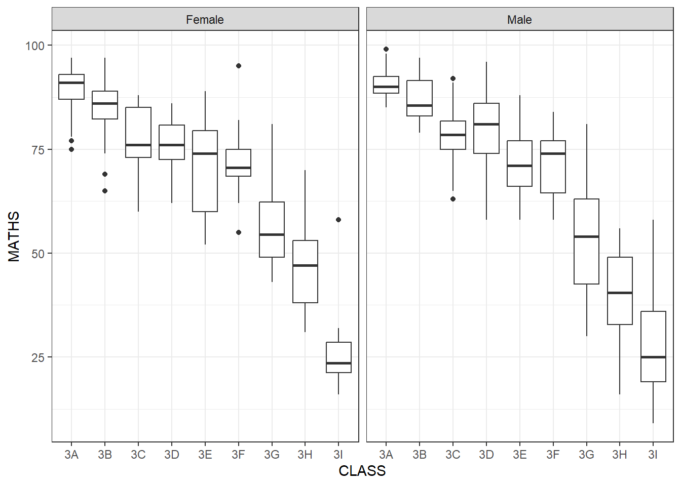
Or we can split them horizontally by using facet_grid(rows*)
ggplot(data = exam_data, aes(y = MATHS, x = CLASS)) +
  geom_boxplot() +
    facet_grid(rows = vars(GENDER)) +
      theme_bw()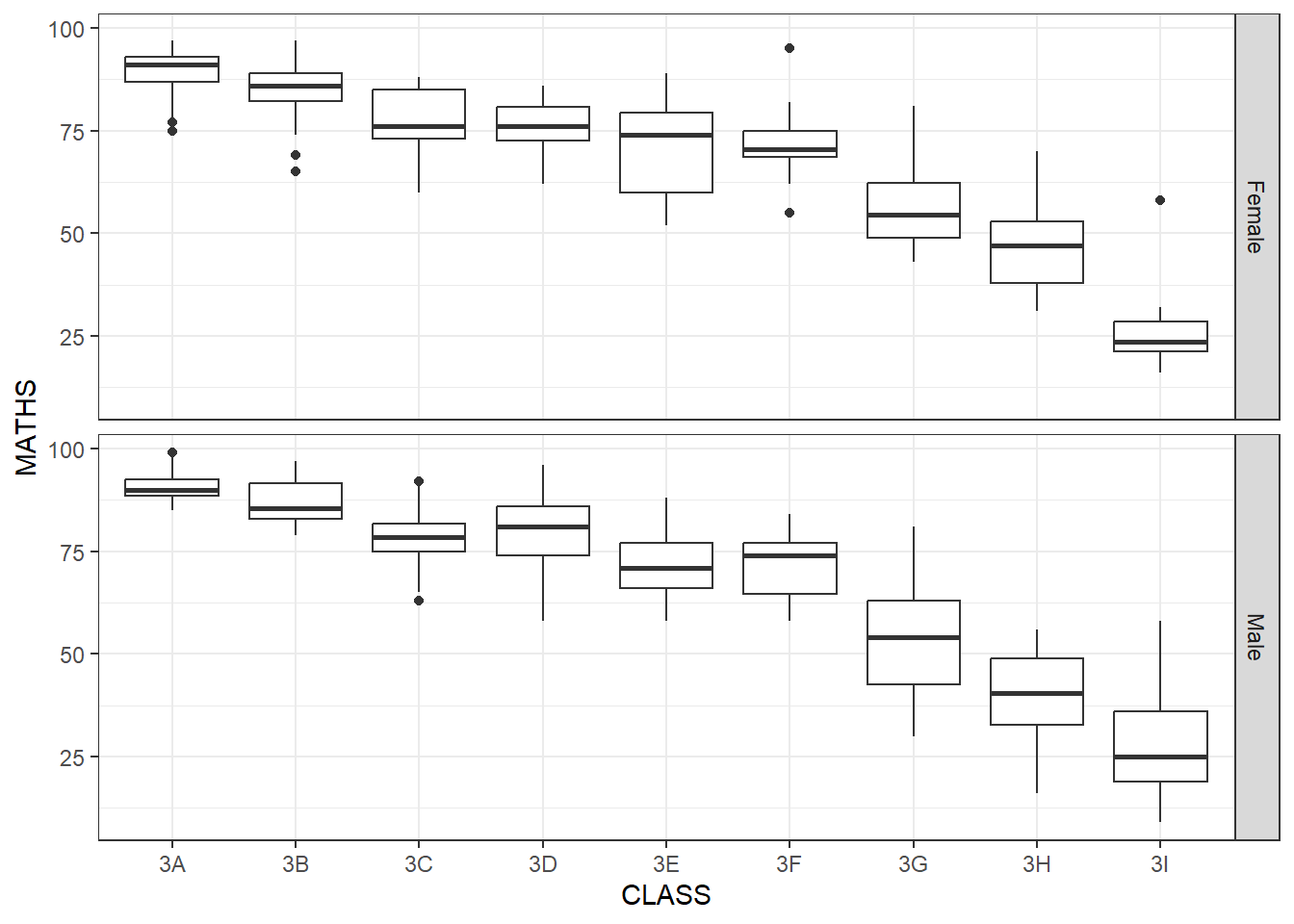
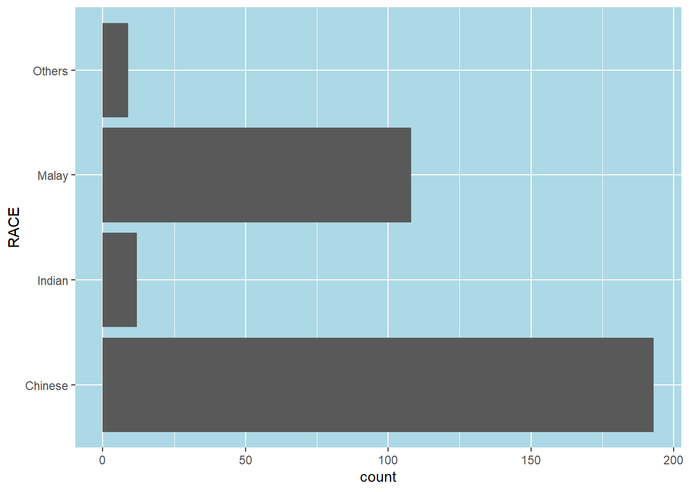
Same thing, we can play around with theme. First we plot b ggplot, use coord_flip() to flip the axis Then we assign the plot to a variable P, then we can design the theme() separately
p <- ggplot(data = exam_data,
            aes(x = RACE)) +

      geom_bar() +

      coord_flip()

p + theme(panel.background =
            element_rect(fill = "lightblue",
              colour = NULL)
          )
#ADDING IN DATA INTO THE VISUALIZATION OF GGPLOT#
We calculate the percentage of races of each students by using mutate() to add in new column for exam_data table. And we use fct_infreg() on RACE column to calculate the percentage of each race.
Geom_text is to add in the percentages for each of the columns
pct_format = scales::percent_format(accuracy = .1)

exam_data %>%
  mutate(RACE = fct_infreq(RACE)) %>%

ggplot((aes(x = RACE))) +geom_bar() +
  geom_text(aes(label = sprintf('%d (%s)',
                            after_stat(count),
                            pct_format(after_stat(count) / sum(after_stat(count)))
                            )
                ),
            stat="count",
            nudge_y = 8 ) +
  labs(title = "No. of Pupils by Race in Exam Results",
y="No. of Pupils") 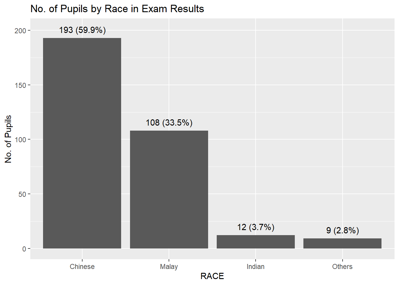
If you want to add in colors for each bar by adding in fill for geom_bar aes() = geom_bar(aes(fill = RACE ), show.legend = TRUE)
pct_format = scales::percent_format(accuracy = .1)

exam_data %>%
  mutate(RACE = fct_infreq(RACE)) %>%

ggplot((aes(x = RACE))) +geom_bar(aes(fill = RACE ), show.legend = TRUE ) +
  geom_text(aes(label = sprintf('%d (%s)',
                            after_stat(count),
                            pct_format(after_stat(count) / sum(after_stat(count)))
                            )
                ),
            stat="count",
            nudge_y = 8 ) +
  labs(title = "No. of Pupils by Race in Exam Results",
y="No. of Pupils") 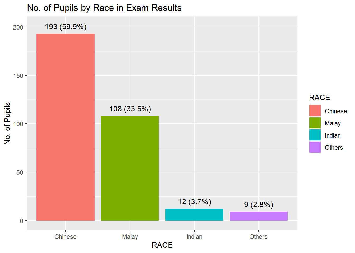
##Adding in Means and median lines on Histogram diagram above##
We can add in geom_vline and use xintercept = mean of the Math score AND xintercept = median
ggplot(data = exam_data, aes(x = MATHS)) +

  geom_histogram(bins = 20, color = "brown", fill="grey") +

  geom_vline(xintercept = mean(exam_data$MATHS),
             linetype="dashed",
             linewidth=1,
             colour="red") +

  geom_vline(xintercept = median(exam_data$MATHS),
             linetype="dashed",
             linewidth=1,
             colour="black") +

  theme_bw()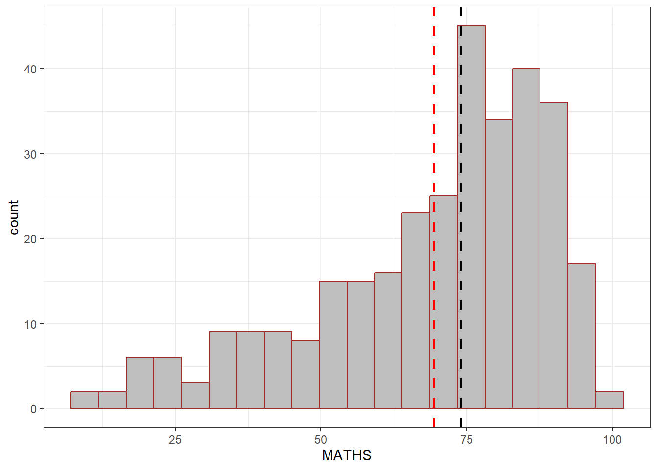
###WHAT IF WE PLOT TWO geom_histogram at the same time, but we use fill= Gender and use facet_grid to seperate them by gender### The overall entire ENGLISH score lightgrey color is in the background, however, the 2nd histogram is filled with aes(fill= GENDER) and facet_grid seperate them into 2 diagrams Without this facet_grid, 2 geom_histogram will basically plot the same data and the lightgrey graph will not appear.
ggplot(data = exam_data, aes(x = ENGLISH)) +
  geom_histogram(data = exam_data["ENGLISH"],
                 bins = 20,
                 fill="lightgrey",
                 alpha=0.5) +
  geom_histogram(aes(fill=GENDER),
                 col="black",
                 bins = 20) +
  facet_grid(cols = vars(GENDER)) +
  theme_bw()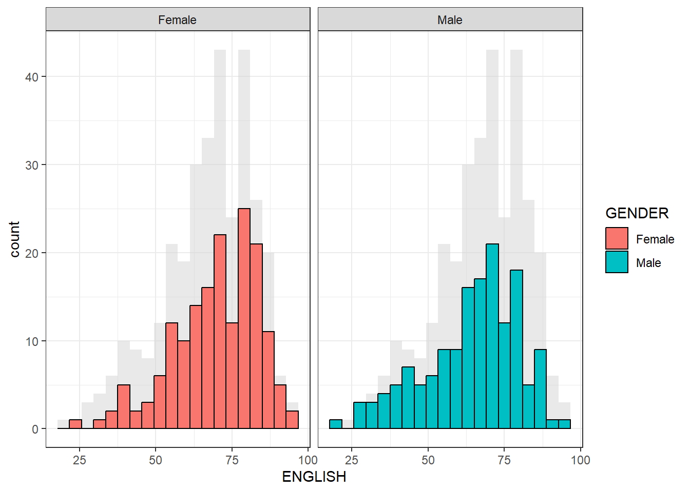
We can use geom_vline and geom_hline to create a fix scale on the graph. coor_cartesian will force both x and y axis to have the same min =0 and max = 100
ggplot(data = exam_data,
       aes(x = MATHS, y = ENGLISH)) +

  geom_point() +

  geom_vline(xintercept = mean(50),
             linetype="dashed",
             linewidth=1,
             colour="grey") +

  geom_hline(yintercept = mean(50),
             linetype="dashed",
             linewidth=1,
             colour="grey") +

  coord_cartesian(xlim = c(0, 100),
                  ylim = c(0, 100)) +
  theme_bw()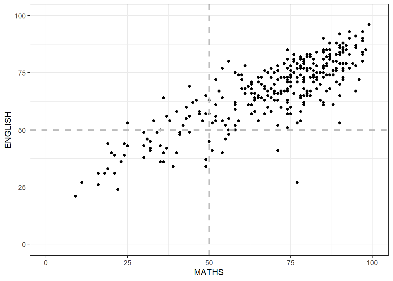
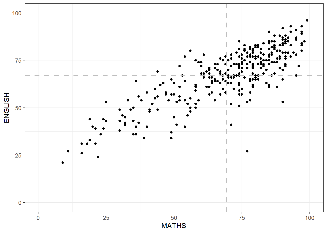
However, above geom_vline and geom_hline, we fixed the x_intercept = 50 and y_intercept = 50 What if we set them = mean of the data.
ggplot(data = exam_data,
       aes(x = MATHS, y = ENGLISH)) +

  geom_point() +

  geom_vline(xintercept = mean(exam_data$MATHS),
             linetype="dashed",
             linewidth=1,
             colour="grey") +

  geom_hline(yintercept = mean(exam_data$ENGLISH),
             linetype="dashed",
             linewidth=1,
             colour="grey") +

  coord_cartesian(xlim = c(0, 100),
                  ylim = c(0, 100)) +
  theme_bw()