Takehome Exercise 1
The Data
Singapore Residents by Planning Area / Subzone, Age Group, Sex and Type of Dwelling, June 2022 should be used to prepare the analytical visualisation. It is available at Department of Statistics, Singapore(in short SingStat).
Let’s examine the data.
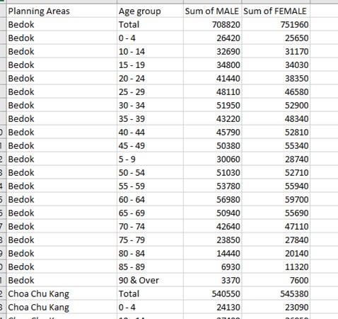
We have 1 excel dataset under xlsx format. Inside we found 3 worksheets: 2022(Total) / 2022 (Male) / 2022 (Female).
Each worksheet has 5 columns as followed:
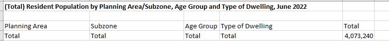
Planning Areas represents the names for each planning areas in Singapore.
Subzone further divides Planning area into small zones.
Age group represents the age groups for population between 0 and 90, with interval of 5 years (0-4 / 5-9 / 10-14 etc…)
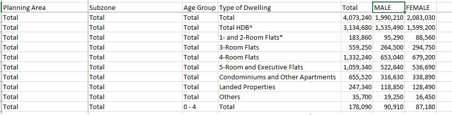
Type of Dwelling represents the types of housing in this census.
Total is the number of populations for each categories.
3 worksheets, represents numbers for Male populations, Female Population and Total.
Our tasks would be creating visualizations from these raw data. Our choices of visualization will be using Age-Sex pyramid.
Data Preparation
First, Age-sex pyramid requires data to be split into male and females. The exercise also requires to split into 9 different planning areas.
First we will copy the columns which contains the total number of male ( from 2022 (Male) worksheet ) and total number of female ( from 2022 (Female)) worksheet to 2022 (Total) worksheet, adding on as 6th and 7th columns.
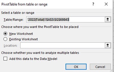
From here, we can create Pivot table which includes all the data under this worksheet.
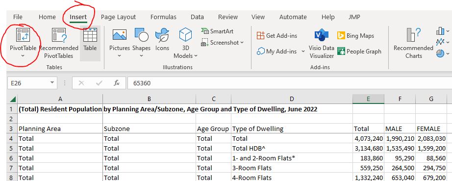
Select entire worksheet 2022 (Total) as Data source
There will be a new worksheet created, as Pivot table.
Now we will drag Planning Area to Rows box for the Pivot table. And we will choose Total as Values box 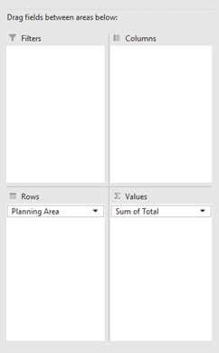
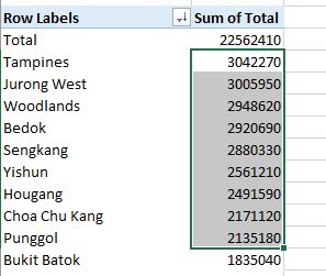
Now we shall right click on the Sum of Total column and Sort from Largest to smallest. We will now select 9 most populous planning areas of Singapore. We shall filter and keep these 9 areas only.
Next step, we drag in Males and Females (drag and drop to Pivot table Values box) and remove the Sums of Total from this Values box.
We will also add in the Age Group, under Rows box.
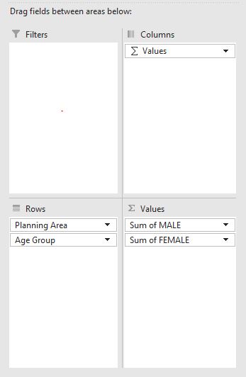
We will have a table of 9 most populous areas in Singapore, and their age-group smaller breakdown.
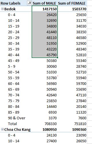
We will filter out the Total from these age group breakdown. (Because the total for each areas are already in bolden first row, so we don’t need this last row of Total anymore.
We shall copy this table and paste-special (values only) to a new worksheet.
Insert a new column in between Rows Label and Sums of Male.
Copy the age group over, we will separate: First column is only for name of Planning Areas ( Bedok, Choa Chu Kang, Hougang etc…) and second column will be only for Age Group.
Our final worksheet, we will have a similar worksheet like this ( under worksheet Sheet1)
DASHBOARD BUILDING
Open new Tableau window. Save and name it as your project.
We can drag the xlsx excel data into this Tableau window.
Drag Sheet1 into the middle (this is the final data table above after data transformation from previous steps). We shall take this as our datasource.
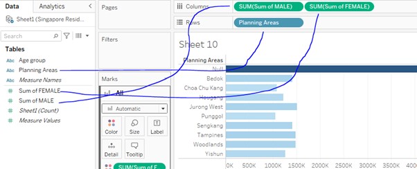
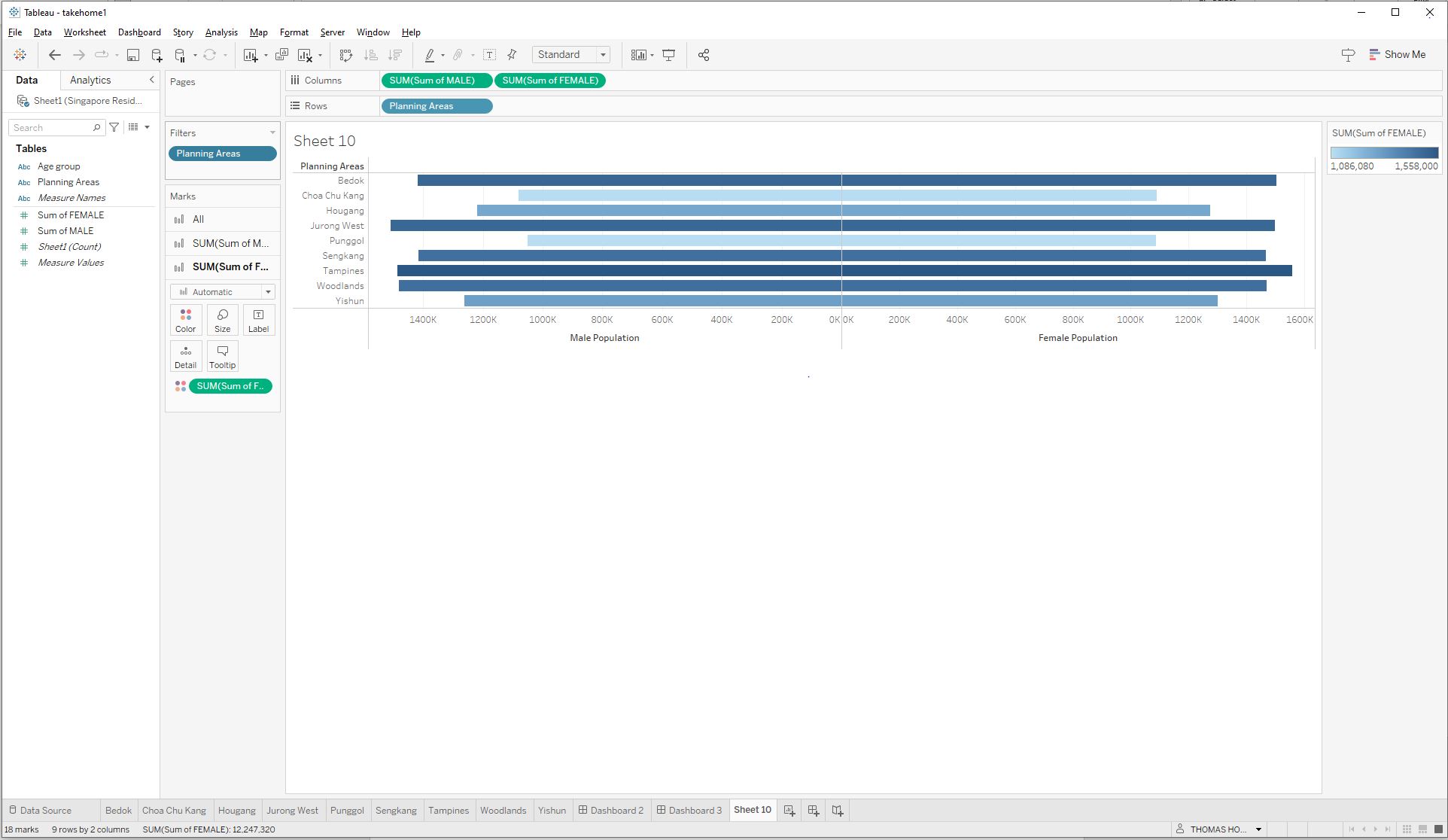
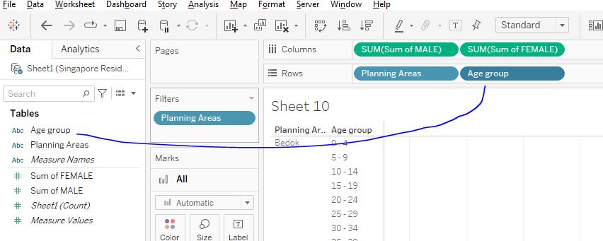
Click on Sheet 1 and we will create the first Tableau Sheet
We shall put drag these items to Columns: Sums of MALE , Sums of FEMALE and Rows: Planning Area
Next, right click on one of the Axis and EDIT AXIS
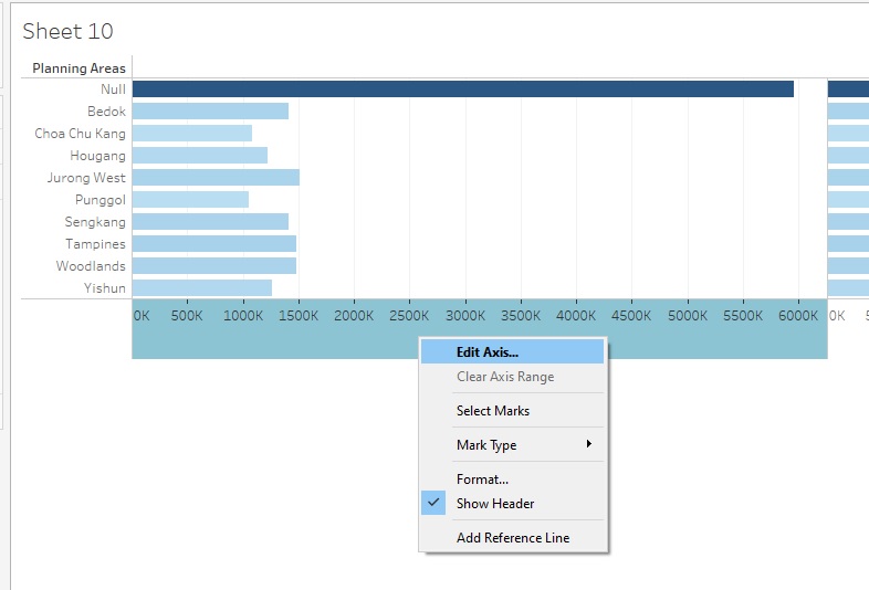
We will tick the Reverse options, as well as rename the axis to “Male Population”
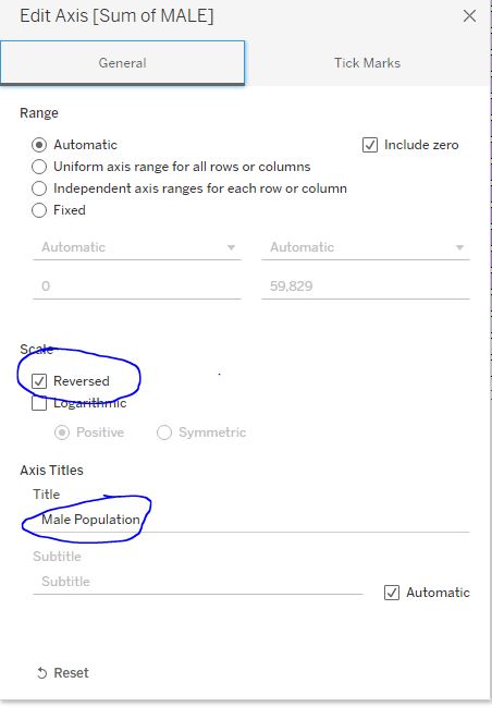
We shall repeat the same for Female side. (but do not tick the Reverse option).
We shall then right click Null value to exclude them from the filter

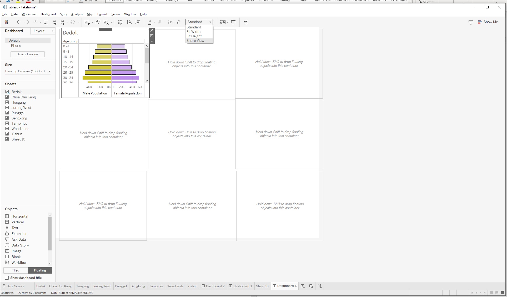
Finally, we will have a pyramid graph, similar to this
We shall right on the Sheet 1, and duplicate this worksheet 9 times, one for each other areas.
We shall rename each worksheets as per each of the planning areas ( Bedok, Choa Chu Kang, Hougang etc…)
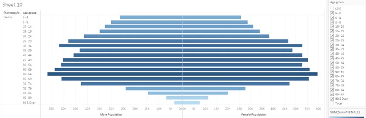
This is already a pyramid graph of Singapore populations for 9 most populous areas, but we still need to break down in term of age group.
We select Bedok sheet
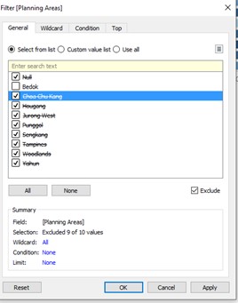
Right click on Filters of Planning Areas > Edit filters
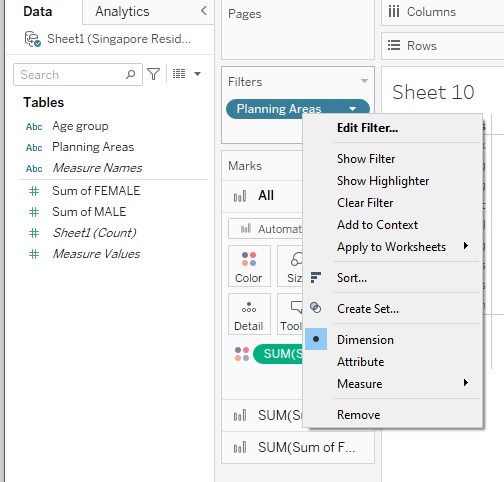
For example, if this is worksheet for Bedok, we can exclude other areas.
Next, we drag Age Group into Rows.
Right click on Age Group > Filter > Exclude Total
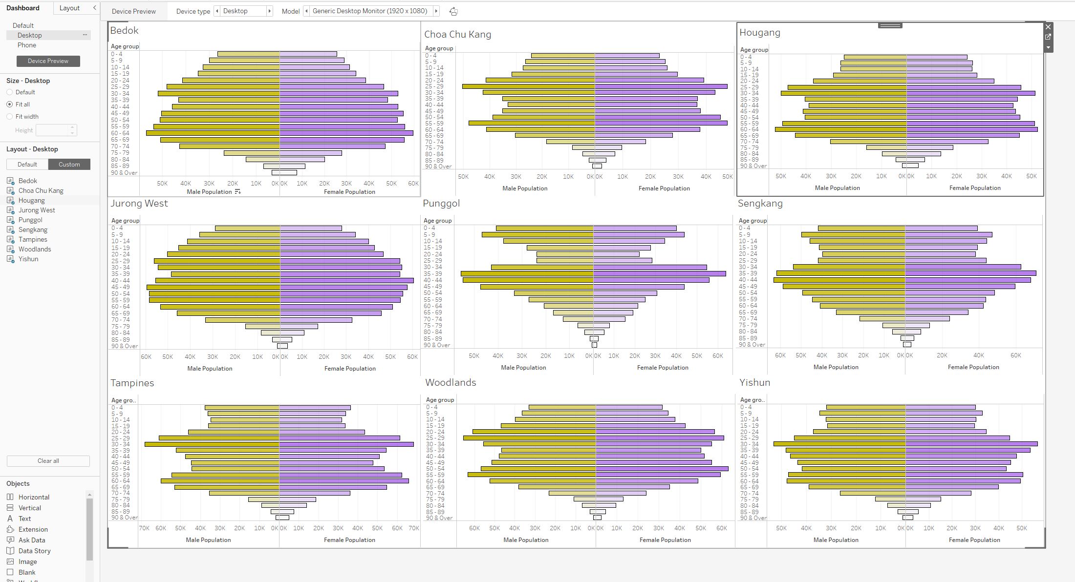
We will have a pyramid graph for Bedok population only: Depict populations between Male and Female, with subsets of each age groups for Bedok areas only.
Next is aesthetics, where we have to input colours to make things more distinctive.
The recommendation would be one half (Male) would be warm and light color, while the other half should carry darker and cold color.
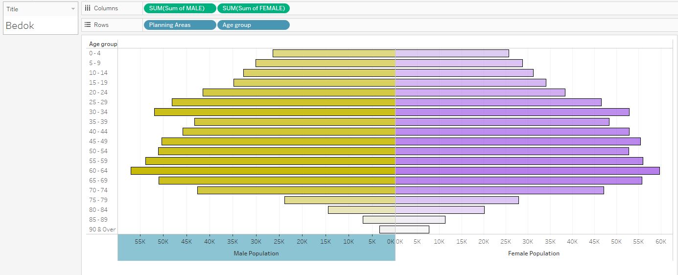
We repeat the same steps above for all 9 planning areas. Remember to maintain the same color codes / formats for all 9 areas.
Lastly, we can building Dashboard.
Create new dashboard

We choose Floating as the setting and choose Vertical objects
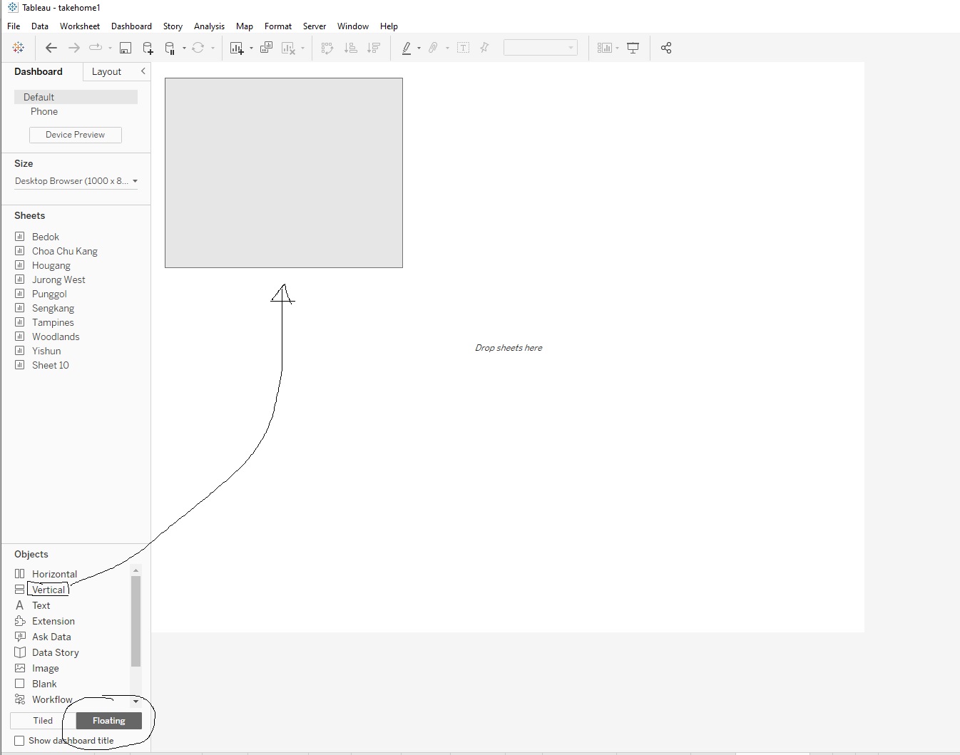
We divide dashboard into 9 evenly horizontal rectangle containers. Next we drag each of the Sheets into each of these container.
Remember to change Standard to Entire view to see entire graph.
Also click on Device Preview and view as Large Desktop Monitor (2560 x 1440) And click on Size ( default is Fixed) and change to Automatic.
After dragging each planning areas into the container. Remove the labels and ledgers ( Plannings Areas, Sum of Male and Sums of Females.
Play around with the 9 planning areas (alignments of lines and borders, colours etc..)
Final results would look similar to this.
Publishing Dashboard
Finally, we can go to Data / Sheet1 / Extract Data
After data extraction (saving Tableau working as .hyper file), we can go to Server > Tableau Public > Save to Tableau Public.
If you have logged in to your Tableau public account, this will be uploaded as a new Viz under your profile.
You can view my published Viz under this link
SUMMARY
Commentaries on the Data
There is a general assumption about Singapore population: Singapore is having an aging population. The general trend observable from the pyramid graphs of 9 different planning areas in Singapore show that they are all middle heavy (meaning the highest segment of population are among the working adults between 25- to 60 years old).
While it is natural that the bottom of these pyramid graph, which represent the elderly populations, are small, due to death, it is indeed an evident of an aging population when most of the top portions of the pyramids are also small. This shows that Singaporean at family-planning age (at the age 25-60 years old) , are not having children, hence the low fertility rate and a smaller tops of the pyramids
A closer look at different planning areas, can give us some patterns on different geographical distributions as well. Generally, other 7 out of 9 areas in this dashboard, for the age between 0 and 20, the younger, the smaller are the population numbers, while the adolescent population are largest among pre-adults’ population. Except Punggol and Sengkang, these 2 areas see the highest percentage of populations of children age, when compared to the rest of population of the area. This may suggest that Sengkang and Punggol are two areas where there are many young families / couples are having children.
The gender distribution of Singapore’s population is relatively balanced, However, there are slight variations in the gender distribution among different age groups. For example, among children aged 0-14, there are slightly more males than females. However, among adults aged 15-64, there are slightly more females than males. And among older adults aged 75 and above, there are more females than males. This is because female tend to have higher life expectancy than male.
Further breakdown by planning areas, Punggol and Sengkang are 2 areas with highest portion of populations among the 25-40 years old, millennial prime working populations, compared to the other age groups in the same areas. This means the average ages of population among these 2 areas would be lower, compared to other matured estates.
In conclusion, while some of areas of Singapore are consisting of younger populations and children / teenage populations, overall, Singapore is still foreseen to encounter an aging population. With majority of graphs are middle heavy ( the working adults age between 25-60), these segment of population will eventually grow older and move to older age groups, while the smaller top populations of children and teenagers are too small to replace the current working adult population. If this is not addressed urgently by the government, this will lead to many social and economic and healthcare problems for the country within next few decades.
About this site.
This is capybara first site that help me start learning Data visualization with many tools
Data Preparation and Cleaning with Excel
Data Visualization by Tableau
Website Design by HTML and R Studio tools to create , render , commit onto Github and subsequently publishing on Netlify