pacman::p_load(readxl)
pacman::p_load(readr)
pacman::p_load(igraph, tidygraph , ggraph, visNetwork, lubridate, clock,
graphlayouts, tidyverse)In Class Exercise 08
NODEXL , opensourced plugin to for Excel to create network graph.
Neo4j (Network Explroation and Optimization 4 Java) to handle big network graph database.
Neo4ji is a NoSQL graph database.
With R, you can use tidygraph API for graph manipulation.
GAStech_nodes <- read_csv("C:/thomashoanghuy/ISSS608-VAA/HandsonExercise/data/GAStech_email_node.csv")
GAStech_edges <- read_csv("C:/thomashoanghuy/ISSS608-VAA/HandsonExercise/data/GAStech_email_edge-v2.csv")
Next, we will examine the structure of the data frame using glimpse() of dplyr.
glimpse(GAStech_edges)Rows: 9,063
Columns: 8
$ source <dbl> 43, 43, 44, 44, 44, 44, 44, 44, 44, 44, 44, 44, 26, 26, 26…
$ target <dbl> 41, 40, 51, 52, 53, 45, 44, 46, 48, 49, 47, 54, 27, 28, 29…
$ SentDate <chr> "6/1/2014", "6/1/2014", "6/1/2014", "6/1/2014", "6/1/2014"…
$ SentTime <time> 08:39:00, 08:39:00, 08:58:00, 08:58:00, 08:58:00, 08:58:0…
$ Subject <chr> "GT-SeismicProcessorPro Bug Report", "GT-SeismicProcessorP…
$ MainSubject <chr> "Work related", "Work related", "Work related", "Work rela…
$ sourceLabel <chr> "Sven.Flecha", "Sven.Flecha", "Kanon.Herrero", "Kanon.Herr…
$ targetLabel <chr> "Isak.Baza", "Lucas.Alcazar", "Felix.Resumir", "Hideki.Coc…Wrangling time
GAStech_edges <- GAStech_edges %>%
  mutate(SendDate = dmy(SentDate)) %>%
  mutate(Weekday = wday(SentDate,
                        label = TRUE,
                        abbr = FALSE))
Things to learn from the code chunk above:
both dmy() and wday() are functions of lubridate package. lubridate is an R package that makes it easier to work with dates and times.
dmy() transforms the SentDate to Date data type.
wday() returns the day of the week as a decimal number or an ordered factor if label is TRUE. The argument abbr is FALSE keep the daya spells in full, i.e. Monday. The function will create a new column in the data.frame i.e. Weekday and the output of wday() will save in this newly created field.
the values in the Weekday field are in ordinal scale.
After formatting, we can see the dataset again.
glimpse(GAStech_edges)Rows: 9,063
Columns: 10
$ source <dbl> 43, 43, 44, 44, 44, 44, 44, 44, 44, 44, 44, 44, 26, 26, 26…
$ target <dbl> 41, 40, 51, 52, 53, 45, 44, 46, 48, 49, 47, 54, 27, 28, 29…
$ SentDate <chr> "6/1/2014", "6/1/2014", "6/1/2014", "6/1/2014", "6/1/2014"…
$ SentTime <time> 08:39:00, 08:39:00, 08:58:00, 08:58:00, 08:58:00, 08:58:0…
$ Subject <chr> "GT-SeismicProcessorPro Bug Report", "GT-SeismicProcessorP…
$ MainSubject <chr> "Work related", "Work related", "Work related", "Work rela…
$ sourceLabel <chr> "Sven.Flecha", "Sven.Flecha", "Kanon.Herrero", "Kanon.Herr…
$ targetLabel <chr> "Isak.Baza", "Lucas.Alcazar", "Felix.Resumir", "Hideki.Coc…
$ SendDate <date> 2014-01-06, 2014-01-06, 2014-01-06, 2014-01-06, 2014-01-0…
$ Weekday <ord> Friday, Friday, Friday, Friday, Friday, Friday, Friday, Fr…GAStech_edges_aggregated <- GAStech_edges %>%
filter(MainSubject == "Work related") %>%
group_by(source, target, Weekday) %>%
summarise(Weight = n()) %>%
filter(source!=target) %>%
filter(Weight > 1) %>%
ungroup()We have 1st column of Source, 2nd Column of target, and the Weight columns represents the number of emails sent from source 1 to target 2, on weekday Sunday.
head(GAStech_edges_aggregated)# A tibble: 6 × 4
source target Weekday Weight
<dbl> <dbl> <ord> <int>
1 1 2 Sunday 5
2 1 2 Monday 2
3 1 2 Tuesday 3
4 1 2 Wednesday 4
5 1 2 Friday 6
6 1 3 Sunday 5Using tbl_graph() to build tidygraph data model.
GAStech_graph <- tbl_graph(nodes = GAStech_nodes,
                           edges = GAStech_edges_aggregated,
directed = TRUE)GAStech_graph# A tbl_graph: 54 nodes and 1372 edges
#
# A directed multigraph with 1 component
#
# Node Data: 54 × 4 (active)
id label Department Title
<dbl> <chr> <chr> <chr>
1 1 Mat.Bramar Administration Assistant to CEO
2 2 Anda.Ribera Administration Assistant to CFO
3 3 Rachel.Pantanal Administration Assistant to CIO
4 4 Linda.Lagos Administration Assistant to COO
5 5 Ruscella.Mies.Haber Administration Assistant to Engineering Group Manag…
6 6 Carla.Forluniau Administration Assistant to IT Group Manager
# … with 48 more rows
#
# Edge Data: 1,372 × 4
from to Weekday Weight
<int> <int> <ord> <int>
1 1 2 Sunday 5
2 1 2 Monday 2
3 1 2 Tuesday 3
# … with 1,369 more rowsReviewing the output tidygraph’s graph object
The output above reveals that GAStech_graph is a tbl_graph object with 54 nodes and 1372 edges.
The command also prints the first six rows of “Node Data” and the first three of “Edge Data”.
It states that the Node Data is active. The notion of an active tibble within a tbl_graph object makes it possible to manipulate the data in one tibble at a time.
GAStech_graph %>%
  activate(edges) %>%
  arrange(desc(Weight))
# A tbl_graph: 54 nodes and 1372 edges # # A directed multigraph with 1 component # # Edge Data: 1,372 × 4 (active) from to Weekday Weight <int> <int> <ord> <int> 1 40 41 Saturday 13 2 41 43 Monday 11 3 35 31 Tuesday 10 4 40 41 Monday 10 5 40 43 Monday 10 6 36 32 Sunday 9 # … with 1,366 more rows # # Node Data: 54 × 4 id label Department Title <dbl> <chr> <chr> <chr> 1 1 Mat.Bramar Administration Assistant to CEO 2 2 Anda.Ribera Administration Assistant to CFO 3 3 Rachel.Pantanal Administration Assistant to CIO # … with 51 more rowsThe nodes tibble data frame is activated by default, but you can change which tibble data frame is active with the activate() function. Thus, if we wanted to rearrange the rows in the edges tibble to list those with the highest “weight” first, we could use activate() and then arrange().
Plotting Network Data with ggraph package
g <- ggraph(GAStech_graph) +
  geom_edge_link(aes()) +
  geom_node_point(aes())

g + theme_graph()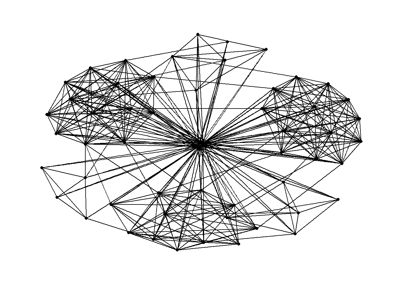
Changing color by using aes(colour) in geom_edge_link , geom_node_point and background color
g <- ggraph(GAStech_graph) +
  geom_edge_link(aes(colour = 'grey50')) +
  geom_node_point(aes(colour = 'grey40'))

g + theme_graph(background = 'grey10',
                text_colour = 'white')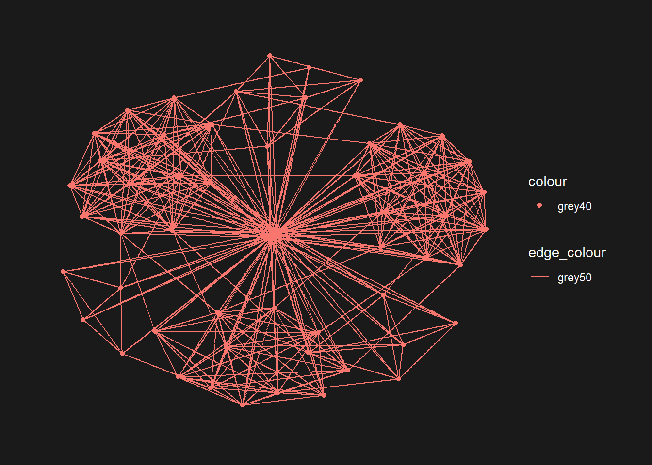
We can add on layout. Also we can add in color differentiation for each nodes by departments wise
g <- ggraph(GAStech_graph,
            layout = "with_kk") +
  geom_edge_link(aes()) +
  geom_node_point(aes(colour = Department,
                      size = 3))

g + theme_graph()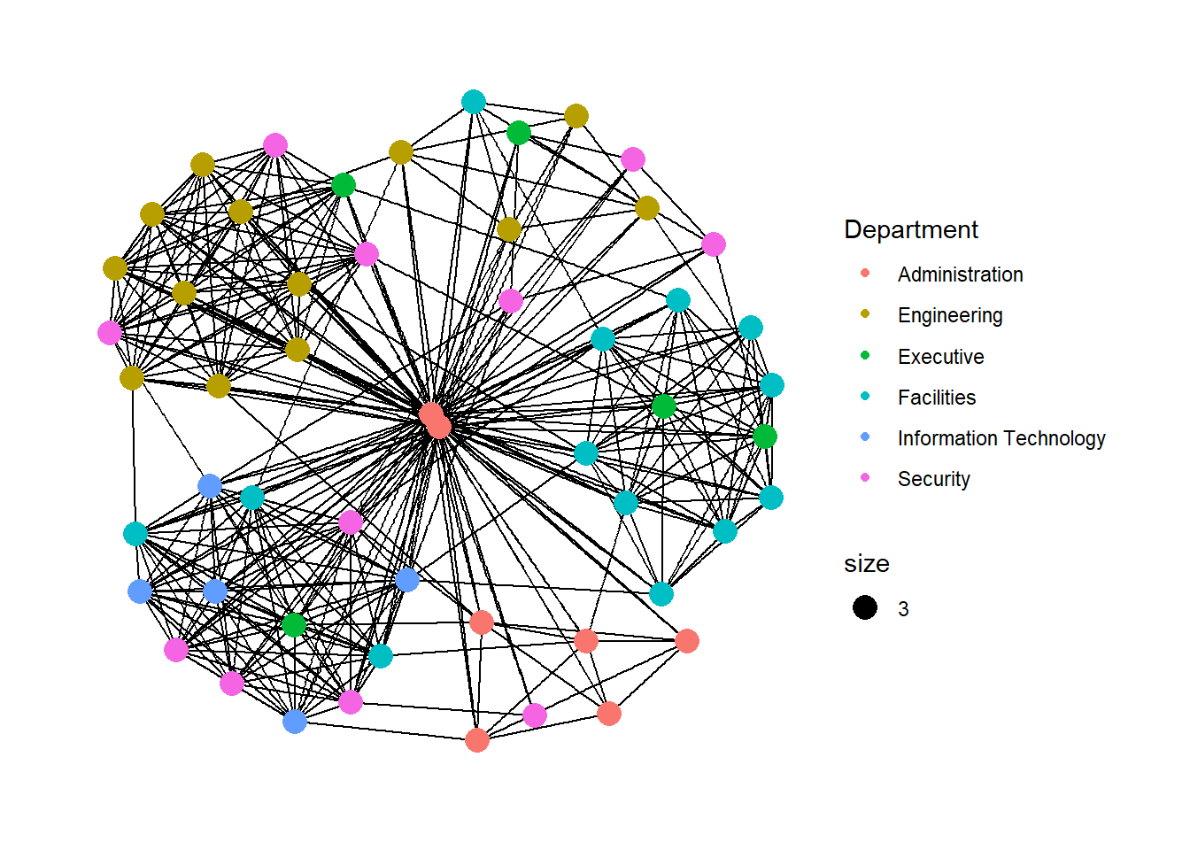
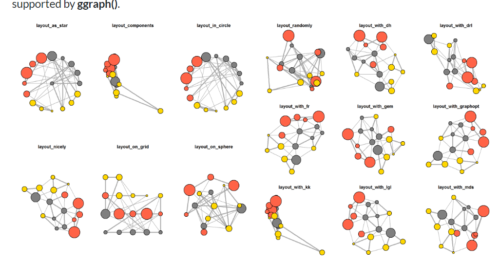
Below is the few different layouts ( besides “nicely”) we can use
In the code chunk below, the thickness of the edges will be mapped with the Weight variable.
g <- ggraph(GAStech_graph,
            layout = "nicely") +
  geom_edge_link(aes(width=Weight),
                 alpha=0.2) +
  scale_edge_width(range = c(0.1, 5)) +
  geom_node_point(aes(colour = Department),
                  size = 3)

g + theme_graph()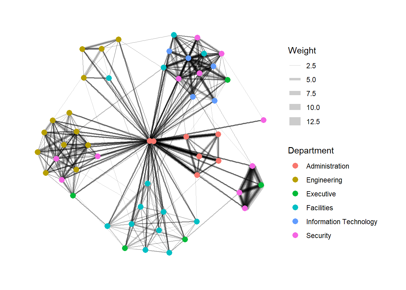
Working with facet_edges()
We can draw from the same datasets, we draw the graph individually for each days.
set_graph_style()

g <- ggraph(GAStech_graph,
            layout = "nicely") +
  geom_edge_link(aes(width=Weight),
                 alpha=0.2) +
  scale_edge_width(range = c(0.1, 5)) +
  geom_node_point(aes(colour = Department),
                  size = 2)

g + facet_edges(~Weekday)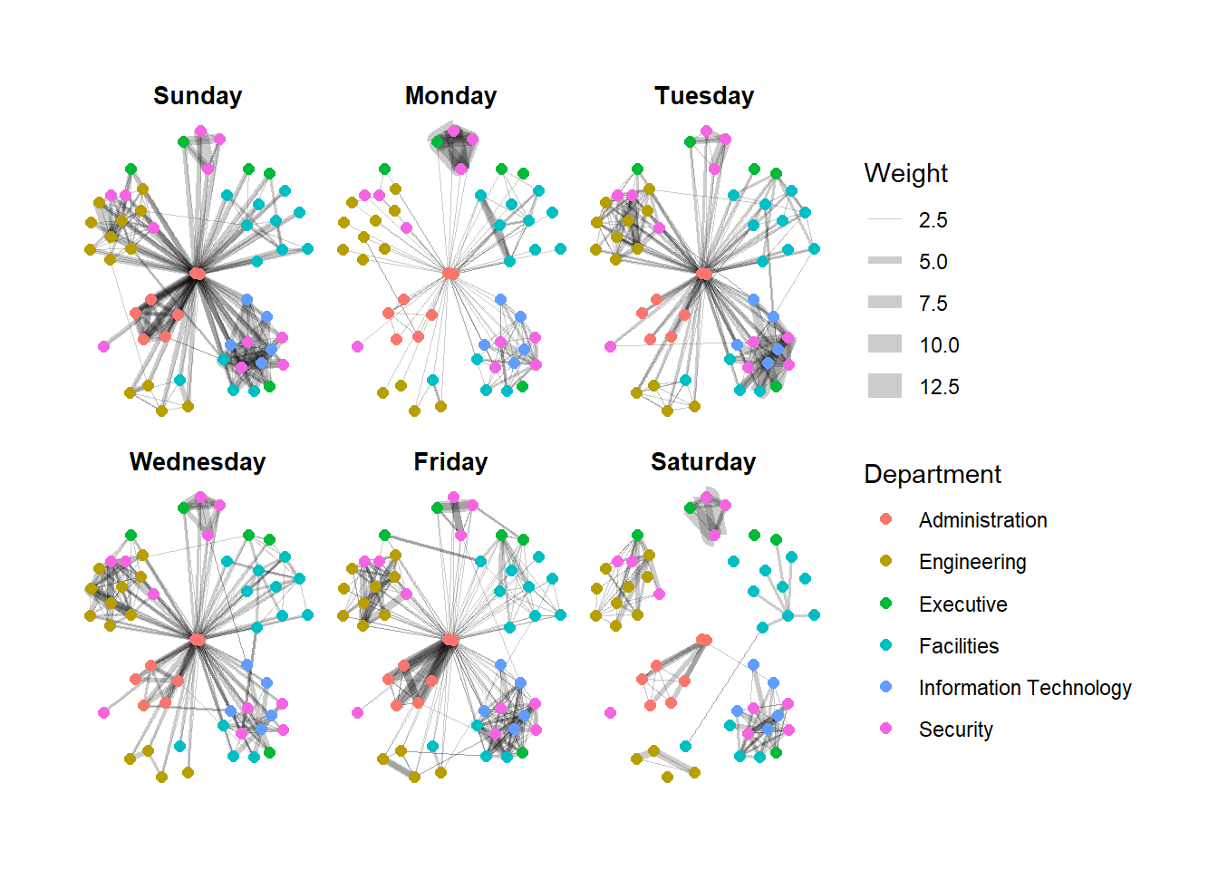
We can use theme() with the above codes, to change the legends to horizontal
set_graph_style()

g <- ggraph(GAStech_graph,
            layout = "nicely") +
  geom_edge_link(aes(width=Weight),
                 alpha=0.2) +
  scale_edge_width(range = c(0.1, 5)) +
  geom_node_point(aes(colour = Department),
                  size = 2) +
  theme(legend.position = 'bottom')

g + facet_edges(~Weekday)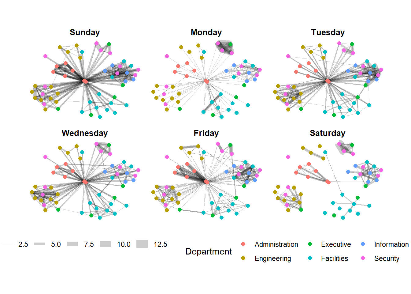
Working with facet_node()
set_graph_style()

g <- ggraph(GAStech_graph,
            layout = "nicely") +
  geom_edge_link(aes(width=Weight),
                 alpha=0.2) +
  scale_edge_width(range = c(0.1, 5)) +
  geom_node_point(aes(colour = Department),
                  size = 2)

g + facet_nodes(~Department)+
  th_foreground(foreground = "grey80",
                border = TRUE) +
  theme(legend.position = 'bottom')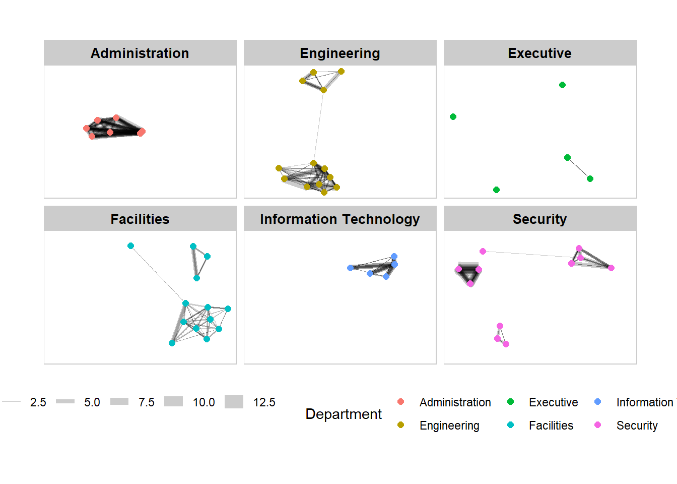
Computing centrality indices
Centrality measures are a collection of statistical indices use to describe the relative important of the actors are to a network. There are four well-known centrality measures, namely: degree, betweenness, closeness and eigenvector
g <- GAStech_graph %>%
  mutate(betweenness_centrality = centrality_betweenness()) %>%
  ggraph(layout = "fr") +
  geom_edge_link(aes(width=Weight),
                 alpha=0.2) +
  scale_edge_width(range = c(0.1, 5)) +
  geom_node_point(aes(colour = Department,
            size=betweenness_centrality))
g + theme_graph()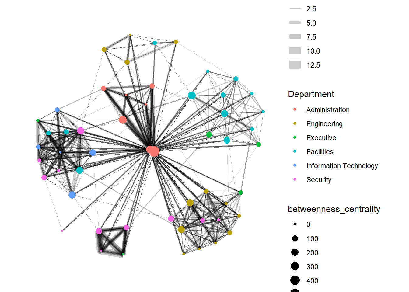
Building Interactive Graph with VisNetwork
Data Preparation
GAStech_edges_aggregated <- GAStech_edges %>%
  left_join(GAStech_nodes, by = c("sourceLabel" = "label")) %>%
  rename(from = id) %>%
  left_join(GAStech_nodes, by = c("targetLabel" = "label")) %>%
  rename(to = id) %>%
  filter(MainSubject == "Work related") %>%
  group_by(from, to) %>%
    summarise(weight = n()) %>%
  filter(from!=to) %>%
  filter(weight > 1) %>%
  ungroup()
In the code chunk below, Fruchterman and Reingold layout is used. U can click and drag the graph.
visNetwork(GAStech_nodes,
           GAStech_edges_aggregated) %>%
  visIgraphLayout(layout = "layout_with_fr")
This will rename Department column to “Group”
GAStech_nodes <- GAStech_nodes %>%
  rename(group = Department)
Note: the purpose of randomSeed = 123, is to make sure that the graph will remain the same next time we re-run this code, if not it will change
visNetwork(GAStech_nodes,
           GAStech_edges_aggregated) %>%
  visIgraphLayout(layout = "layout_with_fr") %>%
  visLegend() %>%
  visLayout(randomSeed = 123)
Working with visual attributes - Edges
In the code run below visEdges() is used to symbolise the edges.
- The argument arrows is used to define where to place the arrow.
- The smooth argument is used to plot the edges using a smooth curve.
visNetwork(GAStech_nodes,
           GAStech_edges_aggregated) %>%
  visIgraphLayout(layout = "layout_with_fr") %>%
  visEdges(arrows = "to",
           smooth = list(enabled = TRUE,
                         type = "curvedCW")) %>%
  visLegend() %>%
  visLayout(randomSeed = 123)
How about we want to choose one particular staff (account) to view related network to that account only?
We use visOption
visNetwork(GAStech_nodes,
           GAStech_edges_aggregated) %>%
  visIgraphLayout(layout = "layout_with_fr") %>%
  visOptions(highlightNearest = TRUE,
             nodesIdSelection = TRUE) %>%
  visLegend() %>%
  visLayout(randomSeed = 123)
Above happen will rename Department column to “Group” . If we want to change the nodes to other columns, for example Labour, then then dropdown list will not only for single employees anymore